Thursday, 26 June 2014

Research Point - the British view

Henry Peach Robinson (1830 - 1901)

At the same time that Social Documentary photography was developing in the United States, photography, as an art form, was taking precedence in the United Kingdom. Henry Peach Robinson was a strong advocate of this view. He produces a book in 1869 titled, 'Pictorial Effects in Photography: being hints and chiaroscuro for photographers, to which is added a chapter on combination printing'. The Getty Internet Archive (2014).

In this work Peach Robinson writes, 'Before placing figures in a landscape, the artist should first make up his mind whether the composition requires the introduction of any object to add to its completeness.'

It is clear that Peach Robinson approaches photography as purely an art form. He is only interested in the human figure in as much as it is an object to be placed into a composition. This is clear from some of his images of the British countryside. The figures in the image below are obviously posed and the landscape is represented as a pastoral idyll - as in the tradition of landscape painting. There are no signs of rural degradation or poverty here.


In regards to 'photographic truth' Peach Robinson goes on to say in his book, 'It, of course, may happen that, in some scenes in nature, figures may be found scattered over the ground in the way set forth in many photographs, and a picture of them may be quite true, and would, therefore, satisfy the desires of the matter-of-fact truth-at-any-price school, who scoff at the idea of art knowledge being of any use to photographers; but it is the purpose of the artist to represent agreeable truth, or, at least, truths that do not irritate the eye, as false quantities jar upon the ear in verse.

Peach Robinson is taking a sideswipe at developing Social Documentary arguments and attempting to establish a counter argument that there is such a thing as manipulated, agreeable truth. I partly agree with Peach Robinson's assertion. The work of both Joseph Hine and Jacob Riis can easily be described as manipulated truth. It is true that in the case of Hine's factory work, the images needed to be staged in order to show the 'hidden truth' of child labour. Some of the work of Riis is also highly posed and even sentimental. I think though it is Peach Robinson's use of the word 'agreeable' that puts his images firmly on the side of art based rather than social documentary photography. Though, I don't think he would disagree with that.

Henry Peach Robinson comes from a tradition of painting and firmly believes in the artistic merit of photography. He is a member of the Linked Ring who are photographers heavily influenced by the Pre-Raphaelite painters. He was at heart a Pictorialist and used combination printing (creating prints from many different negatives) to achieve his artistic intent.

Once again, he is not so different from social documentary photographers that are selecting images and leaving out others in order to tell a political narrative. It is the intent that is different. One is engaged in social reform, the other is purely an art based practise.


References:

The Getty Internet Archive (2014) [online] Available from: https://archive.org/details/pictorialeffecti00robi [Accessed 26th June 2014]

Wednesday, 25 June 2014

Research Point - Early Social Documentary

Lewis Hine (1874 - 1940)

My internet research took me to the The History Place where many of Hine's images can be found. The original photo captions that accompanied the photographs are displayed. The portraits of the child factory workers are quite harrowing to look at. Even though the children are posed quite formally this somehow adds to the sense of despair when the captions are read. In many cases, some arrangement of the composition has taken place (the girl beside the window for example) and sometimes the text can be quite descriptive, even sentimental, in it's attempt to (quite rightly) influence opinion.

Hine had to use stealth to make these images - entering the factory premises under the guise of photographing machinery and equipment. Once he had the trust of mills owners and workers he would set up and surreptitiously get some of the children to stand by the machines. This is not to say that the children's situations have been faked. They clearly do work at the factory under terrible conditions. It is merely that the scenarios under which the children worked had to be staged as Hine would never have been allowed to make those photographs.

Individual child portraits where the subject occupies most of the image have been taken with a narrow depth of field. This throws the background out of focus and allows the viewer to fully scrutinise the child's face - quite an effective technique once the viewer is aware of the individuals name and working conditions. It is possible of course that Hine had little control over his choice of aperture due to working inside and the limitations of camera technology at that time.

BBC news magazine has a video piece on Hine that discusses not only his child factory images but also Newsies (young boys, and sometimes, girls) that roamed the city streets with bundles of newspapers for sale. Alison Nordstrom, curator of photographs of George Eastman House speaks about Hine's work in the video. Nordstrum states that, '[Hine] saw himself as someone who was contributing to social change.' and that 'Most people did not believe that child labour existed or was a problem. His first job was to assemble evidence.' Nordstrum (2014).

Hines images were taken at a time before social documentary photography had even been defined. Nordstrum goes on to say that labour was Hine's core subject and that the child photos could be considered as an example of bad labour; whereas the iconic Empire State building images (good labour) could be seen as showing the workers in a heroic light as man constructs the tallest building in the world in defiance of the 1930s depression.

Jacob Riis (1849 - 1914)

At first glance the images of Riis appear different from those of Hine in that they look less posed and could be considered more authentic. Riis used magnesium flash powder to light the interiors of tenement slum houses and outdoor scenes at night. The popular story surrounding these images are that Riis would move around in the dark, suddenly capturing the unwary subject by the illumination of his flashlight, before hurriedly moving on.

That may well be the case. But, other images (particularly the children around a barrel, below) look very staged to my eyes. The child on the left is half smiling. It is obvious that, for them, the act of being photographed is part of an amusing game. Like Hine, Riis asked people to pose in certain ways.  Many of the images are not candid.


Riis worked as a police reporter and later as a photojournalist. He would have been fully aware of how to present an image or story in a way that would effectively communicate his intent. 'His magic lantern shows used drama to create a virtual reality in the lecture hall. Viewers moaned and shuddered and spoke to the people in the photographs'. Spartacus Educational.com (2012).

Riis book, 'How the Other Half Lives' was intended to present the poor as victims rather than the makers of their fate. His message was that people living in these conditions could become criminals or degenerate and it was the responsibility of society and government to alleviate their plight.

Professor Sharia Diner gives a talk for the NY Public School teachers on Riis (video below). Professor Diner argues that Riis pays no attention to the fact that the vast majority of immigrants did not end up as victims of their plight. Far from being a black pit of degradation as the images show. They have been selectively chosen for this effect leaving out the fact that immigrants belonged to churches, family societies, unions, and indeed were often sending money back home to relatives. Professor diner has pointed out that 'One third of all the money circulating in Ireland [at this time] came from the United States'. NYU Steinhart (2010).

History in the classroom A resource and interview with Professor Hasia Diner. A critique on the work of Jacob Riis.

The book 'How the Other Half Lives' was intended, just like the staged factory images of Hine to awaken the social conscience of the middle classes and wealthy philanthropists - to make them realise that they had a responsibility to the poor.

In summing up the styles of the two photographers appear, at times, very different. Hines work can be seen as more formal while Riis work sometimes seems a bit sensational. That both sets of images are often staged shows that the process is similar but with different stylistic outcomes. What finally aligns the two sets of work is their intent in highlighting to wealthier sections of society the need for social reform.


References:

The History Place. (2014) [online] Available from: http://www.historyplace.com/unitedstates/childlabor/ [Accessed 24th July 2014]

Nordstrum, A. (2012) [online] Available from: http://www.bbc.co.uk/news/magazine-17673213
[Accessed 24th July 2014]

NYU Steinhart (2010) [online] Available from: http://steinhardt.nyu.edu/historyintheclassroom/jacobriis [accessed 25th July 2014]

Spartacus Education.com (2013) [online] Available from: http://spartacus-educational.com/USAriis.htm [Accessed 25th July 2014]

Friday, 20 June 2014

This is Where I Live - Part 2

For the second part of this exercise I had to re-visit the same location as before but this time use my DSLR. I was to try to apply a 'craft approach to the scene' which I took to mean put my compositional skills and photographic knowledge to best use. I'm not sure if I've shown the service area around Ashford International Station and the Designer Outlet at its 'best or most intriguing' - but I have photographed the images in style that I would normally apply.

This time I used my 18-200mm zoom and was able to focus in on certain elements and I have applied more liberal use of cropping and adjustment in post processing than with the first set of images using my compact.

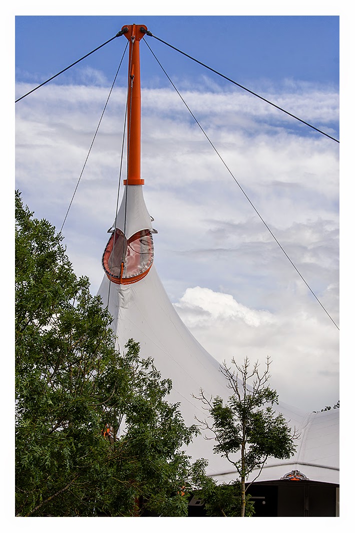
When considering this second set of images and the role of the social documentary photographer it is most definitely possible to create a false impression. In this second approach I have focused more on the buildings that inhabit this space - mainly the outlet centre and the International Station. I have tried to avoid the graffiti and discarded items that can be found in these locations. I have tried to include more greenery in the surrounding walkways and paths too. I was able to focus in on compositions that I saw in my mind that would not have been possible with the small compact camera.

In my choice of location the difference between the two sets is not overly remarkable. But it does show that the photographer can sway the viewer with their on take on any situation. No photographer is without bias. Yes, social documentary photographers do need to approach their projects with integrity. Their reputations are at stake and they cannot be found to have manipulated their images or the situations that they photograph in any way. Yet we do read that this has happened time and time again with many news reports. The viewer when looking at a visual communication medium such as photography needs to be aware that all photographs are political in some respect. I think it is very hard for people to remember this as we can still hang on to the pre-digital view that the 'camera never lies'. In the past social documentary photographers have been complicit in this cultural assumption.

It is interesting that the general reading public don't treat text in the same way. Well, at least people are more inclined to be suspicious of political bias in the press. In some respects the digital photography revolution has helped to dispel many myths. One of the mistakes that is commonly made though is the thinking that manipulation only applies to digital photography. In the rush to criticise it is easy to fall into the trap of not realising that manipulation has always happened - even if that means re-arranging a scene before it is even photographed. Some of the American FSA photographers were known for this.


Friday, 9 May 2014

Exercise: This is where I live

Go out and photograph your local environment in two ways...

This is the first part of the exercise. I've photographed an area in my town using my compact camera on it's standard focal length setting. This is to get a 'warts and all' feel for the place without thinking too much about the aesthetics of photographic composition. I've not used this camera for many years and had to dig it out of storage and check that it still works. It was strange not having access to the zoom feature and also realising that my compositions could be a bit off because of the camera's viewfinder being separate from the lens. I tended to take wider shots because of this. I haven't cropped any of the images and just applied some levels processing to compensate for the cameras overexposure at times. It was actually quite enjoyable wandering around the small area of the town without having to think about exposure settings for once.

Write around 250 words reviewing your images in your blog. To what extent have you managed to to show the 'truth' about your town or area?

This is a difficult question to answer. I decided to photograph a small area of access roads and paths that link the domestic and international rail station and Ashford Designer Outlet. I haven't tried to beautify the images in any way. There were plenty of planted tubs around that I could have used in the foreground of my images in a sort of postcard style if I had wanted to. But does that mean my images are a 'true' representation? I'm not so sure. For a start I am always interested in the 'mundane and everyday' and my photography tends to gravitate in that direction. That I chose the 'behind the scenes' access roads rather than the more formal entrances to these spaces shows that, before I even began the project, I made a conscious decision to portray the images from a certain aesthetic viewpoint. John Szarkowski, in his introduction to 'The Photographer's Eye', states that a photographer has:

[...] learned also that the factuality of his pictures, no matter how convincing and unarguable, was a different thing than the reality itself. Much of the reality was filtered out [...] and some of it was exhibited with an unnatural clarity, an exaggerated importance. The subject and the picture were not the same thing, although they would afterwards seem so. Szarkowski, (1966).

One aspect that is missing from the images is people. I avoided photographing the steady trickle of people arriving and departing from the stations for self conscious reasons – I find it so hard to be seen capturing images of strangers in my local area. It is telling that in the one image depicting people at the bus stop they have their backs to me. I am more comfortable working in big cities like London. For one, the people are more used to it - what with the number of camera toting tourists everywhere. In small towns like Ashford a lone photographer is much more conspicuous.

In summing up I'd say if a person was to go to this area and had seen the images beforehand then on the whole they would recognise it as a fairly truthful representation. But if that person were to take one step sideways or turn around they might be surprised by what they saw – They would also probably be struck by how much busier the paths and roads are. 


Access to Ashford International Station


Tunnel under domestic rail line


Access to domestic rail services


Footbridge over stream and elevated section of  HS1 track


Typical contents of the stream 


More discarded rubbish


Footbridge to domestic rail station


Landscaped area close to the domestic rail station


Buses and cycle racks provide access to additional transport services 


Underpass artwork and graffiti


Long term station and overflow parking for Ashford Designer Outlet


Ashford Designer Outlet


References:

Szarkowski, J. (1966) 'Introduction' to The Photographer's Eye. NY: MOMA. Reprinted (1980) London: Secker & Warburg.

Monday, 5 May 2014


Well, here I am - beginning my Gesture and Meaning blog for my studies with the OCA. This is my final level 2 module towards the BA (Hons). I had originally enrolled onto the Landscape module (paying in advance last year and putting it on hold to beat the price increase). By the time I'd finished PWDP I'd realised that even though the course has had a substantial re-write, incorporating a more contemporary approach to landscape photography, it really wasn't for me. I'm much more interested in making work that involves people - particularly involving constructed imagery - sometimes mixing it up with sequences containing more mundane compositions that I think add something to what I'm trying to say.

I kind of have a love hate relationship with people photography. I don't make portraits as such. It's more like asking people to assume a character for an image or project that I have in mind. In my experience the subjects certainly seem more willing to act out scenarios for me where they don't feel they are being scrutinised by the camera like they would in a traditional portrait. I've made more and more work like this during the course of PWDP and my interests certainly sit more alongside the projects in Gesture and Meaning than they do with the Landscape course.

So, here I am.