I am interested in hidden histories, particularly Gay and Lesbian ones. Like many other minorities we are not in control of our own representation. Because of this our personal and social histories tend to become sidelined and forgotten about.
Because I like to make constructed work I had an idea to produce a hidden history. In fact the bare bones of the project has been developing in my head now for over two years. The requirement of this assignment is to produce ten 'Fine Art' images, and does kind of fit with what I have in mind - so, now seems to be the right time.
Rubber Flapper is a woman from the 1930s that lives in a mysterious self-cleaning Art Deco house. It was designed and built by her adoring husband to keep her safe from the outside world - a world that Rubber Flapper has some trouble navigating. There are hints in the narrative around her sexuality although the facts are hard to pin down. The couple keep themselves to themselves and remain reclusive.
I wanted to approach the story from a contemporary perspective. Putting myself in the place of a photographer that returns to the site of the now demolished house that I remember seeing as a child. I meet the fictional owner of the site, who is also interested in Art Deco architecture. He allows me to photograph the house foundations and rubble-strewn landscape. He also gives me access to a number of storage boxes which contain what's left of the contents of the house.
By examining the boxes contents, the story of Rubber Flapper begins to unfold. I find old photographs, a newspaper cutting, and an ambiguous message written in a book (a widely known piece of Lesbian literature) that hints at my protagonists sexuality and state of mind. There are also pieces of rubber clothing, now well worn, that kept Rubber Flapper safe.
I want to make a series of images that move the narrative through this discovery and end with the site owner becoming alarmed at my interest in Rubber Flappers sexuality. He closes down my access to the boxes and the project is left uncompleted.
That is an awful lot of narrative to put into one book; let alone in ten Fine Art images. I won't try to flesh out the whole story, as the project feels like it is too big to fit within the confines of an assignment. I will tell my narrative as best I can for the assignment and then try to flesh it out a bit more in the accompanying book that will hopefully be ready for assessment.
I need to get the work out of my head. It's taking up valuable creative space! It's been developing and growing for so long. Every time I read something new relating to gender studies, minority representation, or how documentary is changing and evolving into gallery spaces my project grows a little. The recent Joan Fontcuberta exhibition helped to put a lot of my ideas into place - gave me a perspective on how my narrative could be achieved. I can't build huge sets, Gregory Crewdson style, with interiors and rubber furniture. As much as I'd like a big studio to work in, all I have is a minuscule budget and an even smaller kitchen/diner for studio space.
Here are the finalised images:
I couldn't stick to ten! For my assignment there are:
Ten 16x12 tabletop images and five 12x12 landscape. Actually only 9 of the 16x12 images are shown here because one of my images was bought under licence and then I re-purposed it. The licence only allows me a one time usage, so I'm saving it for my proposed book for assessment.
For assessment, the finished book, and proposed gallery exhibit, there are:
Fifteen 16x12 images and five 12x12 landscape. The extra five 16x12 are images of the empty tabletop. This enables me to intersperse them between the landscape images. The blank tabletop represents the contents of the archive boxes that I have been unable to access since the project was closed off to me.


Transcription of newspaper article


The 12x12 pictures will form part of a grid pattern on an adjoining wall.


Below follows a chronology of my progress on this project from start to finish:
Oct 10th:
I am completely buzzing from the Joan Fontcuberta exhibition. The constructed images and artefacts really opened my eyes to the possibilities that I can pursue with my Rubber Flapper project. I was inspired. There were numerous documents to back up the photographs with fake specimens in cases. The same specimens were also photographed in the wild to add authenticity - the concept plays with the nature of truth and fiction in photography. I can see now how my project can progress. I can approach my subject from the perspective of an archive. I can create documents and objects and photograph them in the landscape as if I have just discovered them. Other objects can be pinned to a board or on a table or be photographed being opened or cleaned.
I feel that I definitely have a direction to move in now - rather than all these ideas, forming and re-shaping in my head, with no focus.
My review of Stranger Than Fiction, Joan Fontcuberta
27th Nov:
I've started to order and think about making props. My favourite bit on a project! I found a set of black arm length rubber gloves from a fetish store. They were on sale on Black Friday for just a couple of pounds. I've also found a Deco rubber bathing cap elsewhere. It's white though, so a bit of post processing required there - Rubber Flapper's costume is all black. I need to build a fake exterior wall too. I'm not too sure how to progress with that but will have to have a think about it. I need to make a rotor arm for the house cleaning system. I'm going to see if I can persuade my Brother-in-law, who's a retired engineer, if he can design something for me.
I found some rubber sheeting on the web. I feel quite excited! It will be useful to make the background walls and floors in my images look like they are clad in rubber. I have one particular image in mind where a ceiling rotor arm is shown and that is going to be tricky. I don't think my partner will be too keen on me attaching props to our own ceiling.
Dec 6th:
I visited an artist talk and critique session run by OCASA today. The event was held at the Thames Valley Group meeting space and they hosted the photographer Johanna Ward. Her talk was inspiring. She makes narrative images using landscape and vernacular photography. Ward was exhibiting at Brighton Photofestival recently and I really admired her handmade leporello photo books. Johanna brought along a video of that work and talked about her artistic process. There is a link to the project here:
I shall Say Goodbye with my Strengthening Love For You
In the afternoon The students had their own projects critiqued by Johanna and the other attending students. I took along just a couple of visual aids for my Rubber Flapper project as none of the work for it has been made yet. I was a bit nervous when it came to my turn as I can get tongue tied and worry that I am not explaining my ideas in a concise manner. I think I got the concept across.

Is there an element of rubber fetishism going on in this narrative? That is one of the questions that seemed to spring to mind from the group. Although aware of the connotations (and to be honest I like the possibility of ambiguity in the work) this is not my intention. Rubber lines the interior of the house, covers all the furniture, contents, and Rubber Flapper's clothes. In a practical sense this is to protect from the water that spins from the ceiling rotors. There are also deeper connotations relating to safety and security and armour - to protect from the wider heterosexual world. I think I will need to downplay the fetish element in my images. Although it won't hurt for the idea of a psychological kink to bubble as an undercurrent in the project. People can read it how they want to.
Johanna wasn't keen on my idea to create some Hollywood style portraits. To be honest I was quite relieved as they felt a bit complicated to compose and the idea felt a bit stilted. Not to mention of having to think how to produce 1930s flapper clothing, made of rubber, for my model.
A Joan Fontcuberta style archive received much more enthusiasm. My photographic portraits were to be incorporated into a constructed archive that would contain newspaper cuttings, books and pieces of damaged equipment from the self cleaning system. I was also thinking (like Fontcuberta) about photographing some of the items in situ at the site, but again, Johanna wasn't too keen. It was when she took the glove and spread it out on the table and said that it would make a good photograph on its own, that I immediately saw what I wanted to do! A plain old table - with all of my objects laid out and photographed in the same way.
Johanna also motivated me to get out and actually start making pictures. It is true I have procrastinated for too long with this project and assignment. I think it felt like too big a wall to climb and I was scared of failing.
Finally, I felt I was moving forward...
Dec 7th:
Sticking with my convictions I went out the very next day to take some landscape shots that will be used for the foundation site. Like my constructed images these landscape pictures could be considered constructed too. They were taken about ten miles away from the site of the actual Art Deco house which for many decades has been cleared of rubble and stood vacant. Ironically, there is now building work taking place there.
I spent an hour wandering around my substitute foundation site. There is evidence of foundations of commercial buildings that, if photographed correctly, will come in very useful for my narrative. I'm quite pleased with the results although I will probably need to make further trips.
Dec 12th:
I took another trip out to the foundation site today. I'd been thinking about my concept and decided that the external shots of the ruined foundations ought to somehow incorporate water to visually tie in with the interior self-cleaning house shots. So after an overnight rain shower I drove to the site and photographed puddles and overcast skies. Gerry held a water bottle over the puddles and created some ripples for me. The images came out well, the water has a delicious inky darkness to them.
Dec 20th:
The previous few days I've prepped some images ready for use with a shot I'll be making with my model. I wanted to show Rubber Flapper as a character, the house's rubber interior, and water, all in the one narrative image. To do this I had an idea to make the image of Rubber Flapper through a porthole doorway while her house was in self cleaning mode. The idea came to me from the memory of an interior shot I had taken in a Chicago hotel bathroom a few years ago. The photo has a kind of Modernist vibe to it and I thought I could incorporate the idea into my final composition.
This is the porthole doorway image from Chicago. I've added some water droplets to the window using Photoshop.

I then laid out my rubber sheeting on the kitchen floor and photographed it. The morning light has hit one side and highlights the interesting texture of the rubber.

I processed my images in preparation for my model turning up the next day. For the shoot I set up a roll of white paper as a backdrop and posed her with the rubber cap that I'd purchased from an online store. I couldn't find a black one in my searches so the hat will need extra post-processing to make it black.
The shoot went well. I've used Nicola before in other projects and she is always interested in what I'm doing and keen to help me out. While she was at the house we also tried on the rubber glove in prep for another image. It was far too small (no wonder the gloves were being flogged off cheaply on Black Friday for just a few quid. No-one can get the damn things on!) We had to slit the back of the test one with scissors and re-tape it to her arm.

This is the composite image and I am really pleased with it. There is further work to do though. This image along with a number of others are to be viewed as archive photographs for my project. I need to decide on a size with borders suitable for 1930s images, print them out, age them and then re-photograph them as found objects.

Dec 29th:
Today I began, with the help of my partner, constructing a wall that will be used to make an exterior shot of the house. I'd initially planned to use foam board as it is quite sturdy and easy to cut. The local art supplies shop didn't have them in a large enough size, so instead, I bought two flat pack cardboard boxes from Staples and reinforced them with some garden trellis and tape.

I needed a flap in the wall for the disposal of rubbish. I cut an aperture and then reinforced it with more cardboard and glue to make it look and feel more substantial.

I then covered the whole construction in white paper so that I could reflect the natural daylight. The wall also needs to be white in preparation for post-processing. I have a shot of an exterior wall taken a few days earlier to layer onto my final image to add an authentic looking texture.

I used two of my lighting stands to hold the wall upright - not too bad for a mornings work! I just need to finalise a few small details around the flap and I will be ready to book Nicola to come over for the shoot.

The almost final image. Note the cans with Deco labels. They're cheap tins of spaghetti from Tesco with my labels printed off and wound around them. My attempt at shooting water on the day didn't work. I was really conscious of getting Nicola wet and used a much too small bottle. The water streams didn't show up. In the final image the water was added from a later shoot I did with a watering can. I used a lot more this time.

Dec 31st:
I woke up to thick fog this morning in Kent. My first thought was that this would be a good opportunity to zip down to the foundation site and take some photographs. I want to have a range of images taken under various weather conditions to choose from for my final edit. At the moment I am looking to make images that fit in with my interior water shots. I thought fog would work quite well. Having said that it was not to be. By the time I had quickly showered, dressed and driven the 30 minute drive to the site it was quite clear and sunny. The opportunity wasn't wasted though as it was still early and the sun was very low in the sky. Frost covered most of the vegetation and broken foundations and I managed to get a good selection of shots. I won't know until I've processed them if they will be used or not.
Jan 6th:
I needed another prop to show the ceiling rotor arm that will be used in my self cleaning house. Luckily my brother-in-law, as a retired engineer, is quite handy at making stuff. I showed him a sketch of what I wanted and he'd produced something with bits of old pipe in just a few days. It was perfect! I only needed to make some slight modifications in Photoshop and it looked exactly how I imagined it should.
To shoot the image I lay my rubber sheeting on the kitchen floor and placed the rotor arm on top. It was a bit tricky as the whole composition would have to be flipped 180 degrees for it to look like the structure was attached to the ceiling of the house. I also only had a small piece of rubber sheeting so took a separate image without the rotor so that I could use it to patch up the gaps using Photoshop.
I also used cloning and blurring techniques to age the image ready for it to be re-photographed on my pasting table.

Jan 7th:
I'm trying to make some buttons for the glove that I need to photograph tomorrow. I'd drawn up a sort of Art Deco design for them a few days earlier but the difficulty of transferring the design to such a small piece of rubber is proving to be problematic. In fact the whole rubber button issue is becoming a bit too time consuming. I tried punching a small hole into a piece of rubber but that doesn't look good either. I may resort to Photoshop to design a small button and then copy and paste down the length of the glove. I feel the buttons are needed to infer that the gloved arm protruding from the flap is that of a woman so I need to sort something out. I also wanted to use the button design on the four corners of the frame that will finish off the flap on the exterior wall of the house. I think it's too much though

As well as the buttons I'm also distressing the rubber cap in prep for shooting it on my pasting table. I stretched it a bit too far and it split - will probably help to make it look old in the long run though. I've poured very hot water, bleach, and oil, so far. The cap is still sitting in the sink and I check on it every now and then to see how its deteriorated. I think more distressing is required for authenticity's sake.
Jan 14th:
I'm having a busy day today. I've started to photograph my props (rotor arm, newspaper cutting, the rubber cap, glove, and assorted photographs) by placing them on the pasting table that I purchased from B&Q. Its surface is marked with scuffs and scrapes and then light from the kitchen window helps to show up the unevenness. It is a perfect surface to arrange my props and photograph them. The tricky part now is to make images with a book as a final product in mind. The images will be full bleed, no margins or white spaces, and the surface of the table will run across both facing pages of the book, with a prop on one or both of the pages - probably.
If I'm using natural light then I need to get all my props photographed quickly before the light changes. That is the plan I'm going with for now. Of course the images may not fit into my book layout as planned and any changes will be done in a different light. The get around for this problem is to use a strobe and soft box for consistent lighting. Something to think about for the moment.

Jan 19th:
I printed out the work I'd completed so far on the Rubber Flapper project and took it along to the Thames Valley study group on Saturday. OCA tutor, Sharon Boothroyd, was there along with 15 other students. The majority of us presented work and as always it is really interesting to see what other students are working on.
My project appeared to be fairly well received so I feel positive that the premise for my fictional hidden history was well understood. The prints themselves were a bit ropey as I used my home deskjet printer which makes everything look soft, unsubtle, or a combination of both. There were a number of questions that helped to clarify some niggling points about presentation of the work in my own mind. I'm starting to feel a bit overwhelmed to be honest. I am incredibly overdue with the work and I have decided to not complete a photo book at this stage but to just pick my favourite ten images to represent the project and send them to Simon. The book layout will take so much more time. Instead I hope to complete the work for assessment and just outline to my tutor how I foresee how the book and gallery exhibition would look.
Sharon said she thought the work "had something" which was very encouraging to hear. When I've finalised the ten prints she wants me to send her a link to the project. There is the potential to have a piece written about it on WeareOCA - wow!
Jan 23rd:
In the last few days I've done a complete re-shoot of my table top items, made last minute adjustments, uploaded my files to the online printer, and begun writing up my assignment notes. I'm on track to have the whole assignment posted off to my tutor on Monday. I was a bit crestfallen when my prints arrived. The colour of the background tabletop was noticeably different in some of the images. I'd shot them all under natural lighting in about twenty minutes in order for the daylight to be fairly consistent. I should have set my camera's WB to manual rather than let it do its own thing. I'd thought I'd corrected for this in the RAW interface and Photoshop. The difference didn't look too bad on my monitor. I couldn't live with the prints though. I could imagine if they were on a white gallery wall how terrible the different shades would look. I did a second correction and re-ordered. Fingers crossed they will be okay. My colour blindness really hampers me some times and I am really wary of playing around with the colour sliders too much - If I'm not careful I can create some right monstrosities that look all right to me. With the help of Gerry, my partner, I corrected the images as best I can and the second batch should arrive on Monday. If they are not right they will have to go anyway. I can't afford another 16 pounds. I'll hopefully have all my notes written up by then so despite my last minute hitch Monday is deadline day.
Mar 23rd:
My Rubber Flapper project has been published on the WeAreOCA website. Many thanks to Sharon Boothroyd who has taken an interest in the project since I took it along to a Thames Valley Group meeting recently. Sharon asked me some questions so that she could do a mini interview. I really enjoyed trying to pull my thoughts together for this piece. It got quite a good response when it came out too, so that was good. The write up is here if anyone wants to read it. Rubber Flapper on WeAreOCA.
My own tutor for this module has also given me a number of points that need looking at in respect to this assignment. I must say that I don't agree with all of them but there are some very valid ones that I will need to address.
With this in mind I took the assignment along to another TV Group meeting on Saturday. I had three main questions that I wanted to discuss with the students and Jesse Alexander, the tutor in attendance. I am still concerned that the tabletop backgrounds look too different in terms of colour balance. I've been thinking of re-shooting the whole project for a third time - as time consuming as that would be. Although I don't want the project to look like a perfect typology or some sort of forensic investigation. I actually want it to look quite amateur. The point is that an amateur photographer has stumbled onto the Chez Laurie material and is photographing it in his garage at home. The consensus amongst the group seemed to be that I am indeed over thinking the issue too much and the works look okay as they are - maybe just tweak one or two shots to bring them more into line with the others. That's quite a relief actually. I really didn't want to do another re-shoot.
My second question was in regard to the landscape images. These were not shown on the edit that Sharon did for WeAreOCA. I haven't had a chance to discuss the reasons for this with her yet. Maybe it was a space consideration? Anyway when the work was first shown at the TVG some students thought that the work was stronger without them. Since Sharon's edit I've been leaning towards this thinking too. I was wrong again though. The consensus on Saturday was to leave the landscape work in. There was some discussion around how the landscape shots would be assimilated into the sequence. I mentioned that I had two scenarios in my head. As an exhibition, I picture the landscape and tabletop shots as separate, on different walls with the landscape images, which are square, maybe in a grid formation. The second scenario is for the book format where I picture the landscapes as interspersed amongst the tabletop ones.
My third point to discuss was the final presentation of Rubber Flapper in book form. I stated that I wanted to make a handmade book with a rubber cover to complement the material used in the making of the project. I discussed the idea of somehow embossing or marking the title into the rubber cover and that I wanted it to feel quite chunky in the hand. Portrait format is my preferred form for books. They just feel right in the hand to me. Catherine suggested square which is also an option. As most of my images are in landscape format there was some discussion around how they would fit on the page. The consensus was that they didn't have to fill the page and could easily fit the format if they were the right size. Lots to think about here.
I was given some suggestions by Jesse to look at the work of Terry Richardson, Peter Bobby's High Rise project and Clive Landon - Familiar British Wildlife. I shall follow these point s up in time. Redheaded Peckerwood has also been mentioned a couple of times by students in relation to this project and I have the book on order from the library at present.
May 17th & 18th:
The last two days I've returned to this assignment. I'm working on a couple of new images for the handmade book that I'm presenting for assessment next March (hopefully). One of the images is to be of a torn page from an old photo album. The page will show a photograph that will be used to fill in some more details of Rubber Flapper's life.
For the photograph I needed to acquire a model of a bird - a parrot or something similar. Luckily when strolling around a junk shop recently I found a wooden carved bird for two quid that can be used as a template. I need one so that I can make a rubber hood that will fit it. I researched the Internet for falconry hoods and found something that I could adapt. I printed out and modified my paper template and then used it to cut out a piece of my rubber sheeting. The rubber sheet has been so useful for this project. It has been used to represent rubber walls, floor and ceilings; I've cut pieces off to make a book cover, and now a hood for a parrot.

Once I'd cut out my rubber hood I used steri-strips from the medicine box to pull the seams together. I was worried that glue would be messy and not hold the tough rubber in place so the steri-strips were a good find.

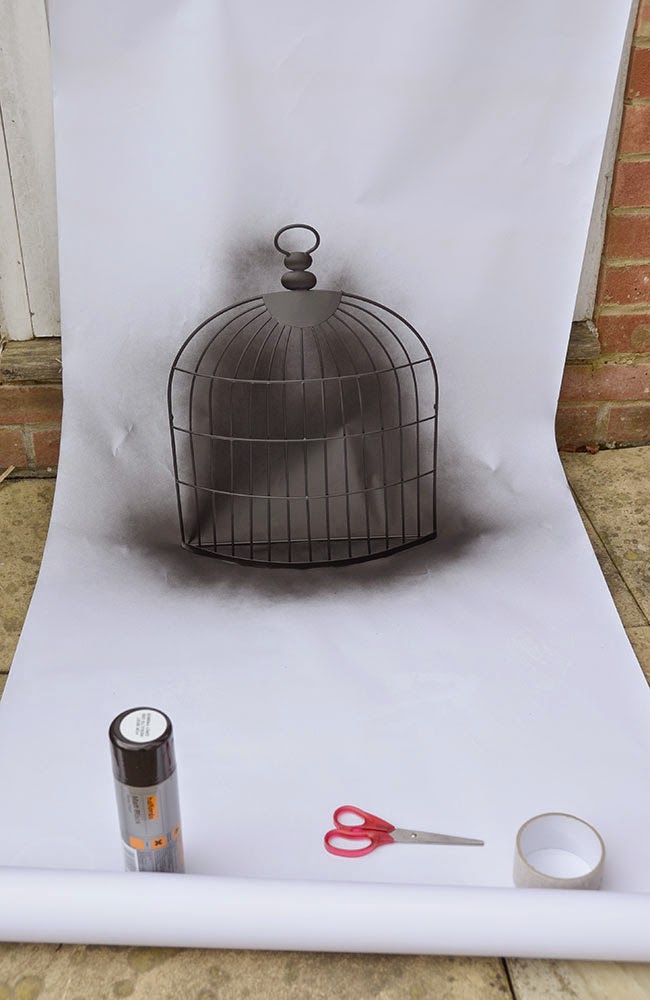
I thought the hood was going to be seriously fiddly and difficult to make, with lots of false starts - it came together surprisingly quickly. Once the hood was made I needed to spray paint a piece of decorative cage that I'd bought from a knick-knack shop. I sprayed it black to represent rubber and waited for it to dry. Once all that was done I was ready to make the shot. I pinned my rubber sheet to the outside of my garage door and placed the cage and parrot on a stool in front of it. I wanted enough distance to throw the focus out on both the rubber backdrop and most of the cage bars. I used my 35mm fixed lens so that I could stop down to f2 for this purpose.
I made my images and then uploaded them to my iMac. I selected the best shot and then worked on digitally replacing the wooden parrot with a shot of a real one. I've only made a rough copy so far. It is a bit scrappy around the edges and needs refining but the image hasn't turned out too bad for a mornings work. Of course, I haven't finished yet...
My first task this morning is to make an old photo album page. I selected a suitable piece of paper in the right shade and thickness and then set about it with a tea dip. I'm waiting for the page to dry at the moment and also need to collect some photo corners from a local store. Once it's all ready I can put my finished parrot photo onto the page and it will be ready for re-photographing on my pasting table.

I will post the image here once it's finalised.

Here it is! I'm quite pleased with the parrot image. It came out more or less how I visualised it. The narrative of the 'Rubber Flapper' project is further enriched by the element of the hooded bird, the old photo album page and the intriguing use of 'Lempicka' for the bird's name. I feel like I'm definitely moving forward with this project!
I also have another interior shot to make and intend to re-use the photo album format for this shot too. Although I think I need a break from the project for a few weeks. I need to return to part four of my course module. To keep on track for March 2016 assessment I need to think about the next assignment.
19th May:
As well as a backdrop to my parrot photograph, the piece of bird cage will be shown as an artifact in it's own right. For this subsequent image it needs to be distressed - ready for shooting on my pasting table. I need to also make some modifications. I cut out some of the bars to make a door opening. Then using the cut-out piece I fashioned a frame to go around it using wooden skewers to make a door frame. Once the glue has dried I need to spray paint it black.

While I waited for that I distressed my bird cage further with a bit of controlled vandalism. Basically I sawed it, stood on it, and pulled and twisted the metal frame into a shape that made it look trampled. I still think the cage looks too pristine with it's new shiny coat of black paint. I'm thinking of spattering some black, brown, and grey over it too.

I've thought about photographing the twisted bird cage at the 'Chez Laurie' site as well as on my pasting table. I want to show it half submerged in a puddle, or peeping out of some undergrowth. This means I'll get an extra shot from this prop so all the hard work will be worth it. The 'Rubber Flapper' book will need extra images, rather than the prescribed limit for the assignment - so the more images the better. I don't think using the birdcage twice will matter too much. By photographing it at the site a visual link will be made in the book with all the other artifacts from the pasting table images.
20th May:
Feeling a bit overwhelmed today. The birdcage needs to look more distressed to be convincing. I've downloaded some images of rusty birdcages from the Internet and had a go at painting onto a spare piece of metal. It is early days but the acrylic paints look too shiny, so once they have dried the metal needs roughing up a bit with sandpaper.
Once I'm happy (if I'm happy that is) I will attempt to do the same effect on the birdcage itself. I've already shot images of the untreated cage, just in case my paint effects go horribly wrong and all my hard work is ruined. I'm getting a bit fed up with the cage now - I want the work to be finished and the shots done and dusted. I hope I can use this paint effect and don't have to go back to the drawing board.

It can be tiring to have to make so many props and then re-photograph them. Especially as that involves using a step ladder to get enough distance from the pasting table. I have to keep getting down to adjust the artifacts on the table and then climbing the ladder again - it's quite an effort to lean out over the table to make sure I'm directly over the the image. Even so my 18-200mm lens creates terrible barrel distortion that needs compensating for in RAW adjustments. Can you tell I'm getting fed up? Ha!

21st May:
The problem with the too shiny acrylic paint has been solved! Gerry suggested that I put sand into the mixture and that will add texture to the effect - inspired! Today we got hold hold of some bird sand from the pet shop. It has crushed oyster shell pieces and it is perfect! This time the paint effect has the right colours and most importantly a consistency of age, dirt and rust.

I'm so pleased with the effect and that after a false start I persevered and worked through the problem.

Once the paint was dry I put the cage onto my pasting table for re-photographing. I tried several compositions. The more formal one with the cage right way up creates an arch effect. This is not very dynamic on the eye and despite the rusted bars and busted bits of metal I found myself tiring of the image very quickly. I'd also taken some shots with the cage at a tilt and moved around with my camera, looking for a more interesting dynamic.
After reviewing my shoot I've picked an image that breaks the arch shape but still manages to keep the focus on the main parts of the cage. I'm fairly pleased with it. Does it look a bit contrived? I will have to leave this image a while and think on it.

22nd May
There was something niggling me about the birdcage photograph. It wasn't quite working. I'd had the idea for the image in my head for a while now and pursued it all through making the cage, putting it on the pasting table, working with my camera to get a good composition etc. But, looking at the finished images, they just weren't working for me. I couldn't work out why and selected the best one from the shoot and posted it to my blog. Now I've had to time to sleep I know what it is. The birdcage image is too visually complicated. I could say the same thing with a much simpler shot and I knew just what to do. That's why I found myself photographing just the birdcage door today.
I spent a little time bending the bars a bit more and was then ready to shoot. Even looking at the door on the pasting table I knew straight away that it worked. I've made the finished photograph into a square format as it is a companion piece to the photo album parrot image. It could represent the missing one from the album and in the book would sit on a facing page. There is a lot of narrative and ambiguity created between these two photographs. A lot is unsaid and left for the viewer to interpret. I'm really pleased with the result and the birdcage will still be put to good use when I take it to the Chez Laurie site for photographing in-situ.

20th Feb
Nine months have passed since I updated this post. I've been very busy making hand made boxes for my assessment presentation and putting the skills learnt in a recent bookbinding workshop to good use. I've also made a leporello book for assignment 1. It came out very well. With that task complete my thoughts are now turning to making a book for Rubber Flapper.
This book will be a portrait style format but made with a Japanese stab binding. This will mean that the pages are pierced along the binding edge and hand stitched to hold them together. The stitchwork is external so needs to be very neat. The pages are usually folded in half with the two edges inserted into the binding. This gives each page a double thickness. The reason for choosing this method is because my online printer does not print double-sided. By printing a two page spread on one side of a sheet and then making a fold will allow me to have images on both sides of the page if I choose.
You may be wondering why I don't just buy a printer and print both sides myself by turning the pages around. Well, buying my own printer would solve a lot of issues with the limited options that online printing presents. But it's also true that I will just gain a host of new issues that come with running my own quality (and expensive) printer. I know some students love to be able to make their own prints. I probably would too. But the thought of those endless sheets of wasted paper and ink just puts me off. I've managed to use online print services very well up to this point in the degree and hope I can continue.
22nd Feb
I've been thinking about the type of paper I'll use for the pages of my book. The fine art paper I used for my leporello is just too thick. It was great for the leporello, because the thickness allowed the book to stand up when the body of the concertina was opened. The stiffness just wouldn't look right for the pages of a book. The only other option with my online printer is to use the single sided photographic paper that I normally use for prints. I took some spare test sheets and folded them over like I'd planned for the stab binding book. They don't feel right either. This time it is not so much the thickness (though they are a bit thick) but the coating on the paper. It feels too plasticky for a book page. Back to the drawing board I feel.
23rd Feb
My next option, I think, is to use Blurb. If I make a book that is larger than required (with loads of extra white space) I can take the book apart - leaving just the pages; I can then cut them to size and insert them into the book. The paper will be the right type for a book and the cost will be no more than if I'd had them printed on special paper (or bought my own printer). I'd already decided long ago that this project would consist of a limited edition run of hand made books. I feel this is important for this project so a simple Blurb book will not do. Besides, I've already purchased the book cloth and materials to make the covers for this book.
10th May
Well the book is all finished. It looks great! I did use Blurb in the end. For complex reasons I had to print my book in a size bigger than required; then after I'd removed the covers, I used my guillotine to cut the pages to the required size.

Once the pages were all cut correctly then it was down to making the fabric covers and waiting for them to dry before assembling my book. As mentioned previously, the book is going to be made with the Japanese stab binding method. This method uses two covers to sandwich the pages together and then small holes are drilled along the spine edge. The holes go all the way through the covers and pages; then thread is used to hold the book together and form a neat pattern on the outside.

I made two versions of the book. The first copy was passed to former OCA tutor, Sharon Boothroyd. She has been interested in the Rubber Flapper work since it's inception and asked if a copy would be possible to include in a lecture she is presenting to her students. I was only too happy to oblige. This first copy came out a little tight. I didn't want the covers to fall apart so may have made them a little too stiff. The second copy that is now ready for assessment is more easy to open.


I am very pleased with the final book. The work is still not completely finished. There is one major image to make before the work is complete - I hope! The project ran away with me and was probably too big for a level 2 assignment anyway. I've presented as much as I can for assessment and hope to continue with the project outside of my studies.
A fascinating project Michael and i've enjoyed hearing about and seeing its development. You've been so creative and thorough in the planning.
ReplyDeleteThanks Catherine. The assignment has been a lot of work, but I've enjoyed it. Sorry for the late reply, I've been ill for the last three weeks.
DeleteSorry you've not been well but hope to see you at next TV group.
Delete