For this assignment I'm supposed to select 4 individuals that belong to a group of some kind and make 3 portraits for each of them - 12 portraits in total. I've decided not to do that, but instead look at the concept of group identities. One of the set books for this course looks at this subject, so I thought I would use this assignment to explore myself and the different group identities that I use to project myself to other people.
To explain the concept, we all adopt different identities. We slip in and out of them to suit a given social situation. There are any number of group identities that we may belong to. For instance, we could be members of the following groups: family, parent, adult child, single parent, teacher, mechanic, train spotter, political activist, photographer, etc. As we inhabit our multiple identities we suppress or project aspects of ourselves. We have identities for at home or in public; when we are with our parents, friends or professional associates.
For the assignment I will follow the brief and make 4 sets of 3 images. But each one would show different aspects of my own group identities - or at least how I perceive them to be. I spent some time thinking about how I am. I thought about public and private sides to myself and also identities that are forced upon me because of the type of society we live in.
I came up with:
Family:

Armoured:
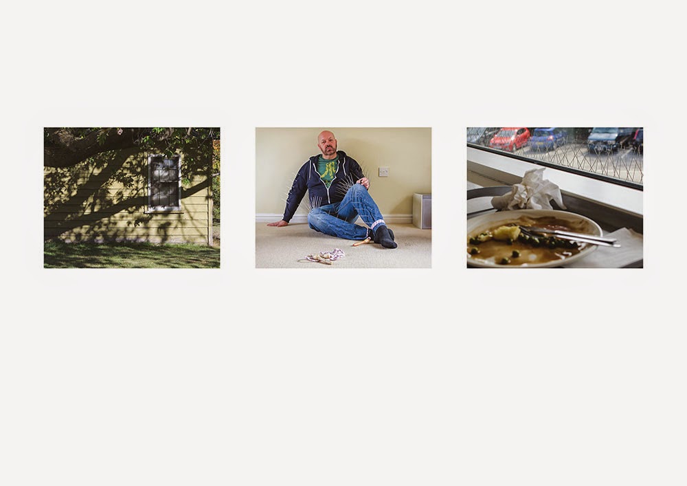
Fetish:
Consumer:

Family:
My first image in this sequence is a snapshot that was taken after a family lunch. I put my camera into auto mode with flash so I could attempt to disregard any of the usual artistic exposure or focusing choices. I deliberately wanted the image to be informal and vernacular. This type of image, where everyone smiles for the camera, is most complicit in showing a 'happy family' stereotype – regardless of issues and personal conflicts.
The second image of the scattered plates in the wood is a representation of my ambiguous feelings about family and an attempt to show rifts and conflict. Portraits don't have to show people. They can be contextual and by the objects or places shown can reflect a state of mind, convey emotion or memory. Sometimes these type of images can say far more about the reality of family life than the vernacular snapshot ever will.
The third image is a response to the Diane Arbus photograph 'A family on their lawn, one Sunday in Westchester, NY 1968'. I wanted to make my own version that shows a family unit that is outside of the Heterosexual binary gender matrix. Quite often people will try to place Homosexual couples in relation to Heterosexual gender stereotypes. 'Who's Arthur and who's Martha?' To circumvent the stereotype I have copied some of the poses, swapped bodies around in relation to the original, and placed masks onto mine and my partner's faces so they cannot be easily read.
Armoured:
The first image in this sequence represents the family home. What happens here structures and informs the developing child's view of family and the the wider world. I'm always drawn to making images of house windows. For me they represent both safety and isolation.
The second image is my take on metaphorical body armour; how a protective cocoon of spikes can help and hinder ones personality at different times and in different contexts. The skipping rope is a metaphor for childhood beginnings, where play and learning take place, and childhood experiences are laid down that are carried into adulthood.
The third image shows anti-pigeon spikes on a ledge at a local cafe. An individuals world view is tempered by past experience. This image attempts to portray how, even in the most mundane situations, parallels with past experience can be recognised by an individual.
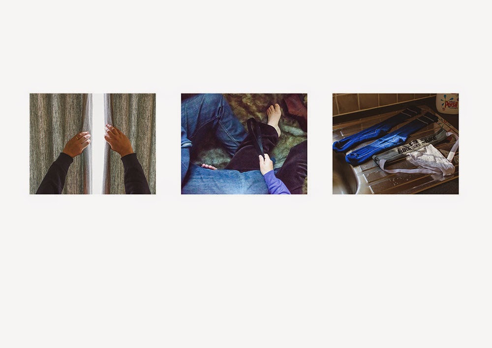
Fetish :
These three images show the private, varied and banal sides of fetish and human sexuality. In the past, sex was often lifted up to some lofty idyll in the arts, as if in an attempt to try and justify the subject in some way. Sex is sex. Animalistic and passionate. That aspect often seems to be missing from the subject in Art. Even Robert Mapplethorpe when he explored these subjects, used a Formalist approach that was, although controversial, primarily aesthetic.
In reading the introductory text to the book 'Robert Mapplethorpe' Keith Hartley states:
Taking his cue from Warhol, who used self-portraiture as a means of self-promotion, self-disguise, self-delusion and self-discovery, all at the same time, Mapplethorpe photographed himself again and again...] [ In a number of works he laid himself bare; in others, he suggested facets of his sexual and emotional make-up...] Hartley (2006).
I find the writer's comments on the use of portraits to project and protect, explore and discover pertinent to the topic of group identities. I would argue that it is the use of different masks/multiple identities that allows us to do this – to try them on, to see how well they fit.
Consumer:
The first image shows how aspects of consumer culture is still changing our society today. It wasn't that long ago that the possibility to drink coffee 'on-the-go' wasn't even an option in the UK. Now coffee express machines are available at most garages, along with drive-thru fast food outlets etc.
The second image shows the British obsession with barbecues – even though our summers aren't particularly reliable, we have bought into a manufactured 'outdoor lifestyle' where the garden is considered an extra 'room' which rather handily for retailers, requires filling with goods.
The third image is conceptual. I wanted to show that although we appear to have choices and options, they are rather limited and directed to a specific purpose – to consume.
I then had to select one image from each set and discuss further:


The final four
In keeping with the assignment brief I have selected one image from each group to discuss:
Family group - plates
Armoured group - window
Fetish group – fur rug
Consumer group - coffee cups
The reason for choosing these four is that I was conscious that they would now be viewed as a single group in their own right. Aesthetically they hang together well. They have similar tones and colour combinations. Also they are all contextual images without a visible face – which is quite telling and leans more towards my particular interests in photography.
Individually, the plates image is one of my favourites out of all twelve. I very rarely enjoy looking at images of people. I can admire the technical ability or composition but I much prefer contextual portraiture where there are objects to look at or the person is absent all together. That is why this particular assignment has been quite difficult for me. The window image, is again, a choice for contextual reasons. It is a metaphorical image that, for me, relates to childhood memory - as a child I spent a lot of time indoors looking out of windows. The fur rug image was quite fun to make and is completely staged. The fur rug is from my bed and has been placed on the kitchen floor. I then had to get into position with my partner and try and hold my camera up and shoot with one hand. I like the slightly blurred and grainy nature of this image – the jumble of legs, hands, and objects inject a dynamic element to the scene.
Below follows a chronology of my time spent on this assignment.
Chronology
Mar 23rd:
While sitting upstairs by the window of Sainsbury's cafe I had some inspiration for one of my identity groups. I'd been thinking about another prop I've just had made for my assignment 1 re-edit. The prop for this is to do with body armour. As I was thinking about the use of metaphor in my images - to relate body armour to protection and survival, I noticed the anti-pigeon spikes on the cafe's window ledge. Perfect! I could get hold of some of these spikes and incorporate them into clothing for more body armour images for this assignment. Hopefully this will also show a sense of continuity between the two assignments. As soon as I got home I did some Google searches and it didn't take long to find the plastic anti-bird strips and order them.
Mar 25th:
These are the cat masks that I've made for use in one of my family images. I need some elastic to turn them into wearable masks. I can't wait wait to re-create this Diane Arbus inspired photograph. The lawn needs cutting first so that the garden doesn't look too shabby - it needs to dry out a bit too.

Mar 30th:
The anti-pigeon strips have arrived and I've been busy incorporating them into a pair of jeans and a top. I had a lot of fun trying to get into the adapted clothing. Once on, it was hard to walk and not damage the walls, myself, or the spikes!


April 2nd:
More test shots today. I found a suitable space against a blank wall in my living room for my body spike shot. The light was better today and the spikes showed up well against both the dark blue hoody and the blank wall - good news, no artificial lighting seems to be required now. Because of using a new spot I did some more test images at different focal lengths. I had to switch to my 18-20mm lens and use a 30mm focal length to put my body in to the frame. Thinking about it now I need to be more methodical as I adjusted my tripod to get the camera lower to the ground. With the new tripod position I could probably swap back to my 35mm fixed lens - my preferred option.
April 12th:
At last a sunny day and the lawn is dry enough to make my Arbus inspired image. In my version I want to mess around with gender identity and family groupings - not sure quite why yet, but once made I'm sure the reason will show itself. I set up the chairs and a table with props. I asked Gerry to get into position while I sorted out the exposure and checked all the settings - I'm sure I drive him completely mad with my antics.

We tried a number of poses and in the end I was quite happy with the results. Here is Arbus's version alongside my own.
'A family on their lawn, one Sunday in Westchester, NY 1968'

'A family on their lawn, one Sunday in South Ashford, Kent 2015.'

April 15th:
A trip to the woods today for another image in my 'Family' grouping. I'd already acquired some plates from a charity shop. They are the type to be seen in a home from my childhood memories - quite 'cutesy' and very traditional. They were easy enough to find and I made a small selection. My idea is to photograph them outdoors, in a wood or field, and to show them half buried.
I eventually found a suitable spot and took some time to randomly scatter the plates. At some point I flung them over my shoulder to try and achieve optimum randomness and one of the plates hit another and broke. This turned out to be one of those 'creative accidents' that helped to break up the symmetry of the round plates against the dark wooded background.

April 18th:
My groups of images are coming along nicely now. I have a number of them and I'm thinking about presentation. I've decided to put the groups of three's onto a single piece of A4 paper for my tutor. The assignment notes asks for one of each grouping to be selected and printed bigger so I will print one from each, full size, onto A4 as well. I've begun post-processing in order to have them ready for uploading to the online printer.
April 21st:
I've made some more images today - all three of the 'fetish' identity group. I wanted a sense of action and movement in these images. I think I've achieved that. I was quite loose with the use of my camera - handholding, not worrying too much about shutter speed. I put a fake-fur rug from one beds on the kitchen floor and enlisted Gerry again to help me make the image. It was really uncomfortable trying to hold my camera up with one hand - it's a D7000, quite heavy - and keep my legs twisted into position and fairly still at the same time. I think the chosen shot was worth it. Most of them came out blurred or pointing in the wrong place.
April 28th:
The assignment notes are written, the images are back from the online lab and the whole lot is now in the post to my tutor. I enjoyed this assignment but am glad to be moving on. I am still quite behind with reading and blogging and keeping my learning log up to date. So much to do!
May 14th:
My tutor feedback for this assignment was fairly positive and there are a number of points that he also made that I need to address before assessment. My tutor felt that the supplied images were too small. He felt frustrated that he couldn't fully see the detail. Catherine, a fellow OCA student, also made a similar comment (if I've read it right) when looking at the images online. I'm kind of pleased by the comments. My intention was to make them small and hard to read. I wanted to create a sense of needing to peer closer, to try and grasp at detail but not quite get there. If I'm entirely honest I don't think I want to be understood. Part of my armour for so long was/is to keep people at a distance. It is what I'm used to doing and where I'm comfortable. So in a way the difficulty of reading the small images could be seen as an intrinsic part of understanding my personality.
I have to find some way of incorporating this element into the assessment. I've toyed with the idea of using a small hand-held slide viewer and creating slides. I have this notion that by holding the slides up to the face the viewer will feel closer to the images, but at the same time the small size will still hold them back. I have to do some investigations into how I can transfer my digital file to slides. I may be able to get this done online, or I may just end up re-photographing the printed images with a 35mm slide camera. Lots to think about.
Jan 20th:
I'm revisiting this assignment in preparation for assessment. My tutor feedback for this assignment noted that I hadn't quite met the brief. This is because the original assignment was supposed to allow for feedback from the sitters of the group portraits. This was to allow them to pick an image that they liked and provide a difference in perspective. Obviously as my group portraits are identity groups of myself, this difference of opinion is lacking.
To counter this I took the images along to the January Thames Valley study group. I showed the images to the group and asked for a favourite image and the reasons why.
A number of the group liked an image from the 'fetish' group the most.

The comments made stated that the image was:
"erotically charged"
"alluring"
"enticing"
"anticipation of revelation"
"you couldn't have made a less sexual image that is so sexual"
"[the image has] a deep connection to the word"
The other image that received a number of favourable comments was from the 'family' group.

The comments made stated the image was:
"relaxed looking"
"in my space"
"positive"
"happy"
[also a contextual comparison was made to the Diane Arbus image 'A family on their lawn, one Sunday in Westchester, NY 1968']
Finally the only other two images mentioned by individual group members were this one from the "armoured" group:

It was mentioned that the spikes conveyed:
"pushing away" [of people]
"attack is a form of defence"
"self harm"
This image is from the "armoured" group:

The aesthetic qualities of this image were mentioned:
"dappled light"
"poetic"
I found this exercise to be very interesting. It was good to know that the majority reading of the fetish image was similar to my intent when making it. It was the image most talked about around the table and seems to have struck a resonant note, which is always good to know when making work.
I was also struck by the fact that some of the students seemed to gravitate to the more "positive" groupings, steering away from images they perceived as "negative". Is this a form of defence mechanism that kicks in when looking at work that may be perceived as dark or troubled? It may be that students will not share thoughts about this work because of the awkwardness of the image maker sitting in such close proximity. These are interesting issues to think about that add a depth or extra layer to the work when it is out of the hands of the maker.
You've certainly made this Assignment your own and in such a creative way. I'm looking at this on my laptop and think I need to look at the images again on my PC to get them at their best. Definitely your voice/style.
ReplyDeleteThanks Catherine,
ReplyDeleteI'm interested to read that you would like to see the images on a larger screen. The small size is intentional. I wanted to make it difficult to fully read them. My tutor has made the same comment as you too, with the physical copies that I sent him.