Friday, 19 June 2015

Punctum


  • a point of visual interest to which your eye keeps being drawn.
  • a point which causes an emotive reaction within the viewer.
  • a point that causes conjecture as to why it makes you feel the way you do about the image.

These three bullets from the course notes are useful for remembering how punctum works. I would also say that punctum is subjective and that although studium is always embedded in an image (to enable the viewer to decode it) punctum isn't always present for an individual viewer.

I looked at some (non-OCA) student's examples of punctum and studium on the web. In my opinion there were some clearly incorrect examples being used. A photograph of an upturned car, placed in the centre of the frame, is clearly the subject of the image - and therefore part of the image's studium. If, for instance, the photographer had photographed a woman standing against a wall covered in pasted news headlines then, the woman is the subject, and the mass of newspaper headlines (for the photographer) are an interesting backdrop - all part of the studium. If, in one of those newspaper pictures, the upturned car could clearly be seen, then that could be a point of punctum for those that perceived it. That to me, is what punctum is.

But when I start to think more deeply about the definitions of punctum and studium, I see issues with regard to the points above. What if those points were specifically created by the maker? Can they still be punctum? Surely sometimes those points are specifically placed into an image to be decoded as part of the studium. So how can they be punctum? Is it just because the viewer sees them that way and doesn't perceive the intended denoted or connotative message?

When I think of the constructed work of Cindy Sherman for example. When every element has been planned; when every prop has been placed into the image; how can a viewer see any punctum? I took some time thinking about these concepts and eventually saw that a point in an image can have entirely different connotations than those intended by the maker. Perhaps punctum could be perceived in this way - a point could be both studium (placed there with connotations/denotations for the maker) and punctum for the viewer as it triggers different thought processes, memories, etc. I'm straying into the slippery path of the subject of the de-centered image here.

I think the points above work well when analysing documentary or 'straight' images. That's how Barthes analysed the image of his mother at the winter gardens. And indeed, I've been fascinated by mundane or obscure details taking place in the background of images myself, many times. But when I start to look at conceptual or constructed work with punctum and stadium in mind then I find that these definitions become slippery and less easy to grasp.

Wednesday, 10 June 2015

Exercise: Targeting an audience

This section of the module looks at advertising. The fourth assignment is designed to pull together what I've learnt in this section and make a calendar. I have no idea where I'm going with my ideas yet -  I have to think about them a bit more and complete the exercises.

This first exercise of this section asks me to look at three current adverts and analyse them as to who, what, and how:

Who is the intended market for the product?
What are they selling?
How are they selling it to the customer?

For the product below the who and the what is obvious; we all eat breakfast cereal don't we? The how I've written in more detail for two adverts below:

This ad for Weetabix uses the notion of health and vitality to portray their product. The image implies that only two ingredients exist in Weetabix - sunshine and wheat; the consumer only has to add the milk for a nutritious, healthy breakfast. There are no people visible in the ad. Many people are needed to transform the wheat in a field through to a factory formed product that ends up on the breakfast table. Once harvested by mechanical means, the product is processed in a factory with added chemicals. This is part of an efficient production process to add colour, texture, and sweetness to the product. Other chemicals are added to lengthen the storage and shelf life.

The ad ignores the reality of factory food production and instead visually imbibes the product with wholesome goodness. 


This ad for the same product uses a completely different approach. Gone are the notions of natural products growing in a sun-kissed field untouched by mechanical production and processing methods.

This image is more post-modern in its visualisation. The viewer is shown a rather grand table setting with a fancy spoon and plates (notice there are four plates stacked from smallest to largest) They all have a crown emblem, as does the napkin ring and spoon handle. This is a breakfast fit for a queen.

I think this advert works on multiple levels. It would appeal to those of a conservative disposition who would perhaps aspire to and enjoy all things grand and traditional. The text 'Fuel Britannia' I think is a knowing nod to 'Cool Britannia' a phrase that was in circulation during the 1990s. The text is there to diffuse any sense of stuffiness and makes the whole image a visual pun. For me, it conjures up additional images of mopeds, street cool, Ginger Spice in her union jack dress - a modern Britain that still keeps the best of its traditions. This is a clever image that works for different audiences.


Below are some more adverts I've noticed online:


This advert is for an I.T. outsourcing company:

Who - I would say that the customers clients are other companies that need I.T. services to enable them to operate their business. This advert would be aimed at professionals making financial decisions on behalf of their companies.

What - Expertise in I.T. services and also peace of mind that sudden technical breakdowns or mammoth infrastructure overhauls can be handed over to a third party to sort out.

How - Through the use of sizeist humour and narrative. In the foreground, a guy with a muscular physique and cool jeans stands legs apart, his hand on hip. He scratches the back of his head at the thought of 'scaling' such a 'mammoth' task as the naked woman on the bed. The implication being that we wouldn't want to undertake the task ourselves (because she's fat, innit!) but the guy in the jeans is ready to have a go, no matter how difficult, he gets the job done  - 'HILARIOUS!'  Oh, HO! HO! HO!

In other words, by outsourcing I.T. services, all those insurmountable I.T. tasks (such as upgrading infrastructure etc) will be done by a company with a willingness to figure out how to complete the job.

I do wonder how the woman model feels about being photographed and used in an advert this way?


This advert for Burger King surprised me. I thought family oriented companies didn't go in for this type of humour.

Who - the clients that eat the produce. This would be people of all ages and demographics.

What - they are selling convenience food that can be consumed either at rest stops, or on the move.

How -  sexual humour is being used to promote the product. I'd be interested to know actually how a family audience would react to this visual imagery - with it's obvious references to seven-inchers and blow jobs. Maybe the ad works on the level of an in-joke between adults that children are oblivious to.


When advertising works well it is enjoyable to read and see. Where the industry lets itself down is its continual re-enforcing of visual stereotypes. I have to say how surprised I am at the blatant stereotyping on most of the advertisements I researched online. I'd thought as a society we were starting to move away from this kind of rubbish. It appears that as long as the concept is done in a jokey way then it's acceptable. The whole culture of  'it's not sexist, racist or homophobic - it's just 'banter' seems to be very prevalent for the last few years. Also, as I tend to fast forward through adverts on TV, don't buy fashion magazines or newspapers, I think I've been a bit caught unawares by how much sex is still used to sell product.

The advertising industry is a very creative place but creativity is directed by market forces. If it makes money then all is good. Sometimes adverts are deliberately designed to shock. Even bad news is good news. It is hard to see if this attitude will ever change.

Wednesday, 27 May 2015

Research Point: Contemporary Awareness 3

Jeffrey Stockbridge

Another photographer that, for me, has an inspiring body of work is Jeffrey Stockbridge. 'Kensington Blues' made on the streets of Kensington Avenue, North Philadelphia, features portraits of the area's inhabitants. The area is consumed with drug dealing, crime and deprivation. With that said the portraits, always made outside on the street, portray the subjects with an inner calm. A calm before the storm perhaps, as the visual narrative that can be read on the subjects faces and bodies tells a different story. The subjects are mostly youthful, and their youth gives them a strength to hold out against the abuse of their bodies - but the strain is there to be seen.

'Tic Tac and Tootsie' a portrait of twin sisters that are homeless and addicted, took third place in the Taylor Wessing Portrait Prize in 2010. Alongside the portraits Stockbridge has documented Kensington Avenue itself from a Social Documentary perspective. Images of empty houses, boarded windows and rubbish strewn back alleys are photographed along with letters and found objects.

The street scenes and found objects add context to the portraits and the series is a substantial piece of work.
http://www.jeffreystockbridge.com


Paul Floyd Blake

'Personal Best' featuring portraits of young Olympic athletes, is Blake's best known piece of work. He won the Taylor Wessing Portrait Prize for his image (from the series) of paralympian swimmer Rosie Bancroft. The subjects look calm and contemplative and have a quiet determination about them. Blake uses a 5x4 film camera to slow down his image making and I'm wondering if this is translated to his subjects as he works through his artistic process. I remember at a talk by the photographer Tom Hunter that he mentioned how more seriously his subjects took the session when what was perceived as a 'professional' camera was used.

Blake states in an article for The Guardian that:

"The series is probably less about sport than it is about young people growing up and the transition from childhood into adulthood," he said. "These teenagers exist in this ultra-professional world that can often be very isolating. It is about them growing up and how the experiences they have now shape them for the future." Guardian (2012).

The images of these young athletes certainly show a different side to their character compared to the usually overly slick action packed commercial photography that we are used to seeing of sports people.

The other work of photographer Paul Floyd Blake shows how portraits can be done in a much less formal style. The work feels like a mixture of portrait and social documentary. Posed shots to the camera, often taken on the street, look so much more natural than traditional studio work. Portrait images are interspersed with landscape and detail shots using a visual language that reminds me of Alec Soth. Portraits are also taken in the subjects home adding another layer of context.

I prefer this kind of informal portraiture to the more traditional studio shots that used to be the stock in trade of more traditional portrait photographers; particularly celebrity and famous people work. They look so terribly contrived to me. The performance by the subjects are usually cranked up to the maximum and so easy to spot. Actors want to look serious, comedians funny, writers thoughtful, etc. Of course we all wear masks and even the subjects of the more natural looking street portraits are still performing in some way. I suppose the more contemporary work just feels fresher - maybe it will look just as contrived in twenty years time - who knows?

http://www.paulfloydblake.co.uk


References:

The Guardian. 2012. [online] [Available] http://www.theguardian.com/artanddesign/2009/nov/04/taylor-wessing-photography-prize Accessed 27th May 2015.

Monday, 25 May 2015

Deutsche Borse Prize 2015 - The Photographer's Gallery


Nikolai Bakharev

His day job a communal services factory photographer in 1970s USSR, Bakharev also photographed families relaxing at the beach. The images are small, tightly framed B&W photographs in the tradition of social documentary photography. The images are mostly posed with the subjects looking directly at the camera. They were taken at a time under the Communist regime when photographs of personal intimacy and nudity were frowned upon (the subjects are mostly wearing bathing costumes). The photographs are well composed and aesthetically pleasing.

During the student discussion of the work afterwards it was mentioned that they had a surreptitious feeling of being behind the bike sheds; that as images they felt tight and closed. I didn't pick up on this feeling myself. I actually made a note at the time that the people look relaxed and happy to be taking part in the making of the portraits; that there is 'no sense of restrictive behaviour' as indicated in the artist's statement; I wonder if the small print size, and tight framing helps to direct the viewer towards the closed reading. I feel I want to go back and take another look at these photographs to see if I can discern an alternate reading to my first reaction.

Zanelle Muholi

This work was the standout exhibit for me. Muholi photographs black LGBTI people in South Africa. Her portrait work shows people solidly united in the face of prejudice, intimidation, violence, torture and often murder. The portraits are B&W, printed to poster size, and pinned with no visible wall space between them. They form a solid block of people united against adversity. To me the subject's eyes all speak one message; the words of Mulholi herself. "If I wait for someone to validate my existence, it means I will shortchange myself." Mulholi (2015)

On a side wall two video screens tell the stories of Lesbian women that have been tortured for their sexuality by their own communities. These are quite horrific and too much to listen to at times. The events are simply told almost matter of fact, such as a woman's teeth found scattered around the area of her murdered body - these details stay in the mind. The term 'Curative Rape' is mentioned. It seems that some men and supportive women will use any justification to freely abuse their power over others. I've often noted that Homophobic hate crimes can be extremely sadistic and the perpetrators often seem to relish their ability to cause pain and torture.

On the opposite wall to the video screens is a sheet that has a number of written messages of support from the UK LGBT community. Although we have legal protection in the UK this added element to the exhibition is a reminder that in many societies there is still much to be done to achieve full equality and that hate crimes still take place everywhere. There is no getting away from the fact that some people just wished that LGBTI people didn't exist; that we should just shut up about asking for something as basic as wanting equal rights with the rest of society.

The wall opposite to the portraits had a slideshow projection. These photographs were mostly in colour, less formal at times, and showed wedding groups, displays of affection between couples - a more social side to the subjects. To me the contrast made an important statement; that this is how LGBTI people want to be. The unity portrait posters on the opposite wall are more political. They show how we have to be.

Mikhail Subotzky & Patrick Waterhouse

This work depicts the demise of a high-rise tower block in South Africa. Two, tall light boxes, containing images the size business cards create an impressive visual display when seen at a distance - almost like stained glass windows. When viewed up close we can see that the images make up views out of the Ponte City tower blocks windows, interspersed with interior room scenes. On another side of the light box the inhabitants TV Screens are photographed. The larger wall prints depict scenes in and around the high-rise. Some of the prints had small found photographs pinned to them, adding an extra layer of intertextuality. The found objects continued on another wall with what looked like an old lace table cover, letters and more found photographs. The work was visually interesting, though I understand it suffered from lack of space at the Photographer's Gallery compared to its recent showing at the Arles Photo Festival.

Vivianne Sasson

'Umbra' is Latin for 'shadow' apparently. From a visual perspective this work was much more conceptual than the other pieces. The artist's statement says that the work is 'a manifestation of the human psyche'. The artist has chosen to depict this state in a number of different ways. There are purely abstract pieces that contort and intersect visual planes that confuse the eye. The work reminds me somewhat of Laura Letinsky's folded paper taped to walls, they create the same effect too. Sharon Boothroyd mentioned Jason Evans and I can also see a similarity in the work.

There were also more conventional photographic prints that featured shadows or blacked out sections in one form or another. What was interesting was that some items were framed, some tacked by their top edges only, leaving the bottom of the photographic paper to curl outwards. Was this intentional? The artist must have know that by not tacking all four corners that this curling would occur. Is it to reference the multiple planes of the more abstract pieces?


Context

When I think about my own work I can relate it to Zanelle Mulhoni's exhibit. They are both about identity and in particular LGBTI. Whereas Mulhoni has looked at the subject from a political perspective with social elements, I have taken a more conceptual approach with the fictional hidden history - particularly in terms of the "Rubber Flapper' work. My other assignments too have mainly looked at identity in one aspect or another. I'm still finding my way with this subject - taking different approaches, looking at personal and larger social issues.

I can also take away something from the 'Ponte City' work too. Subotzky and Waterhouse's use of found objects is an element in art making that has always intrigued me. I have used appropriated images from the Internet in my first assignment. Could these be considered a kind of cyber found object? I'm not sure. With Sasson I wonder when I get to my level 3 studies if my work will indeed become much more abstracted. I feel I might be moving that way, but my sense of narrative is probably too strong to ever make a completely abstract piece of work.


References:

Mulholi, Z. Exhibition video excerpt. The Photographers Gallery, London. 2015.


Friday, 1 May 2015

Redheaded Peckerwood - Christian Patterson

This book was recommended to me by fellow students at an OCA TV group meeting (thanks, John). I'd presented my 'Rubber Flapper' work and the discussion had moved on to my ideas for presenting the work in book format.

Redheaded Peckerwood is a book that visualizes the true-life story of Charles Starkweather and Caril Ann Fugate. In 1957 the couple went on a road-trip shooting spree across Wyoming and Nebraska. The book contains a combination of trial photographs from the newspapers of the day, the photographer's images of described events, places the couple visited and reproductions of evidence often found on the victim's bodies. The book has an intriguing mix of the real and the imagined.

The introduction is in the form of a small booklet attached to the inside cover. It looks like it is typed on a mechanical typewriter and the fold-out format is an indication of the overall quirkiness of the book to come.

The layout and picture format are what really interested me. The images jump about from page to page. They change ratio and orientation. Analysing the way the spreads are set out will be really useful in helping to inform my 'Rubber Flapper' book design ideas.

One of the most interesting aspects of the book is the aforementioned pieces of evidence. They are inserted between the pages in their original ratios. For example, there is a gas station receipt that is much smaller than the book pages. It looked almost like it had been placed between the pages as a bookmark. Later in the book, a larger fold-out sheet, containing a poem, helps to add a sense of being able to touch real life artifacts. These little changes in format are interesting ways to enhance the narrative and are very effective.

Juxtaposition is used very effectively to visually enrich the narrative. We know from the books introduction that Robert Colvert, a young gas station attendant, was murdered by Starkweather. So when we see a brightly painted advertisement 'Ask for Ethyl' facing another image of a luminous oil spill we are left in no doubt about the metaphor - for the life that was shed on the concrete of a gas station forecourt.

There are other metaphors for murder too. Starkweather and Fugate murder a number of 15 year old Fugate's relatives along the way. Bullet holes in walls; a small knife protruding from peeling plasterwork - spilled ink. As we turn the pages we are taken on a death-trip across sombre landscapes; dirty beds with rumpled sheets; telephone wires in old houses - telling a tale of flight through the landscape; sleep captured fitfully and ill at ease.

The most compelling aspect of Redheaded Peckerwood is the seamless integration of real and imagined events, blended and brought together. As the viewer we do not know what is real or imagined - nor do we care. We are on our own vouyeuristic road-trip. Just like Starkweather and Fugate we've seen this movie before. We already know what the ending will be.

Thursday, 30 April 2015

Trish Morrissey - Front

I first saw Trish Morrissey's work 'Front' at the Turner Contemporary, Margate. It was part of the 'Self' exhibition that showed works from various artists, Warhol, Emin, Jason Evans, Gillian Wearing. The concept for the exhibition was to look at image and identity.

In Trish Morrissey's photographs, she'd approached groups of people relaxing at the beach and asked to be able to swap places with one of the women. She wore a token item of the person's clothing and after setting up her 5x4 camera, got the original woman to participate by taking the picture.

Morrissey describes the beach as a place where the boundary between natural chaos and cultural order collide. The series title 'Front' alludes to both the seafront and the masks that people wear in public.

I liked the images in the exhibition (I think there were about five from the series on display). I am interested in identity and the social construct of the family and I found both the images and the concept behind them intriguing. It is interesting that as a viewer we cannot really tell the difference in a photograph between a real family and one that has been infiltrated.

I'm reminded also of Jamie Diamond's 'Constructed Family Portraits'. This is where complete strangers were asked to pose as family groups. I remember this seemed to cause some consternation for some of the OCA students at the time, as they felt they had been tricked into believing in the images. I suspect an unconscious anger at breaking a social convention is taking place here. I think we are sold the idea of the perfect family from a very early age through the media and is culturally reinforced at every level. To break those ties is a social taboo and can make people uncomfortable. This is also why regardless of family conflict, we mimic happy family poses in photographs and participate in our own deception.


Tuesday, 28 April 2015

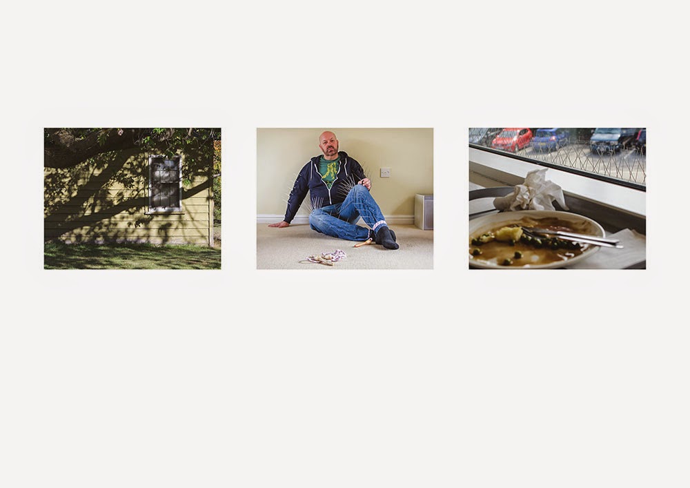
Assignment 3 - family. armoured. fetish. consumer.

Assignment 3, group portraits.

For this assignment I'm supposed to select 4 individuals that belong to a group of some kind and make 3 portraits for each of them - 12 portraits in total. I've decided not to do that, but instead look at the concept of group identities. One of the set books for this course looks at this subject, so I thought I would use this assignment to explore myself and the different group identities that I use to project myself to other people.

To explain the concept, we all adopt different identities. We slip in and out of them to suit a given social situation. There are any number of group identities that we may belong to. For instance, we could be members of the following groups: family, parent, adult child, single parent, teacher, mechanic, train spotter, political activist, photographer, etc. As we inhabit our multiple identities we suppress or project aspects of ourselves. We have identities for at home or in public; when we are with our parents, friends or professional associates.

For the assignment I will follow the brief and make 4 sets of 3 images. But each one would show different aspects of my own group identities - or at least how I perceive them to be. I spent some time thinking about how I am. I thought about public and private sides to myself and also identities that are forced upon me because of the type of society we live in.

I came up with:


Family:


Armoured:


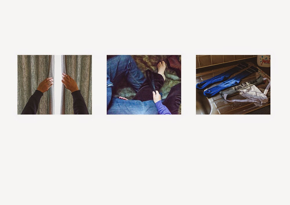
Fetish:


Consumer:


Family:
My first image in this sequence is a snapshot that was taken after a family lunch. I put my camera into auto mode with flash so I could attempt to disregard any of the usual artistic exposure or focusing choices. I deliberately wanted the image to be informal and vernacular. This type of image, where everyone smiles for the camera, is most complicit in showing a 'happy family' stereotype – regardless of issues and personal conflicts.

The second image of the scattered plates in the wood is a representation of my ambiguous feelings about family and an attempt to show rifts and conflict. Portraits don't have to show people. They can be contextual and by the objects or places shown can reflect a state of mind, convey emotion or memory. Sometimes these type of images can say far more about the reality of family life than the vernacular snapshot ever will.


The third image is a response to the Diane Arbus photograph 'A family on their lawn, one Sunday in Westchester, NY 1968'. I wanted to make my own version that shows a family unit that is outside of the Heterosexual binary gender matrix.  Quite often people will try to place Homosexual couples in relation to Heterosexual gender stereotypes. 'Who's Arthur and who's Martha?' To circumvent the stereotype I have copied some of the poses, swapped bodies around in relation to the original, and placed masks onto mine and my partner's faces so they cannot be easily read.

Armoured:
The first image in this sequence represents the family home. What happens here structures and informs the developing child's view of family and the the wider world. I'm always drawn to making images of house windows. For me they represent both safety and isolation.

The second image is my take on metaphorical body armour; how a protective cocoon of spikes can help and hinder ones personality at different times and in different contexts. The skipping rope is a metaphor for childhood beginnings, where play and learning take place, and childhood experiences are laid down that are carried into adulthood.


The third image shows anti-pigeon spikes on a ledge at a local cafe. An individuals world view is tempered by past experience. This image attempts to portray how, even in the most mundane situations, parallels with past experience can be recognised by an individual.

Fetish : 
These three images show the private, varied and banal sides of fetish and human sexuality. In the past, sex was often lifted up to some lofty idyll in the arts, as if in an attempt to try and justify the subject in some way. Sex is sex. Animalistic and passionate. That aspect often seems to be missing from the subject in Art. Even Robert Mapplethorpe when he explored these subjects, used a Formalist approach that was, although controversial, primarily aesthetic.

In reading the introductory text to the book 'Robert Mapplethorpe' Keith Hartley states:

Taking his cue from Warhol, who used self-portraiture as a means of self-promotion, self-disguise, self-delusion and self-discovery, all at the same time, Mapplethorpe photographed himself again and again...] [ In a number of works he laid himself bare; in others, he suggested facets of his sexual and emotional make-up...] Hartley (2006).

I find the writer's comments on the use of portraits to project and protect, explore and discover pertinent to the topic of group identities. I would argue that it is the use of different masks/multiple identities that allows us to do this – to try them on, to see how well they fit.

Consumer:
The first image shows how aspects of consumer culture is still changing our society today. It wasn't that long ago that the possibility to drink coffee 'on-the-go' wasn't even an option in the UK. Now coffee express machines are available at most garages, along with drive-thru fast food outlets etc.

The second image shows the British obsession with barbecues – even though our summers aren't particularly reliable, we have bought into a manufactured 'outdoor lifestyle' where the garden is considered an extra 'room' which rather handily for retailers, requires filling with goods.


The third image is conceptual. I wanted to show that although we appear to have choices and options, they are rather limited and directed to a specific purpose – to consume.


I then had to select one image from each set and discuss further:


The final four

In keeping with the assignment brief I have selected one image from each group to discuss:

Family group  - plates

Armoured group - window

Fetish group – fur rug

Consumer group - coffee cups

The reason for choosing these four is that I was conscious that they would now be viewed as a single group in their own right. Aesthetically they hang together well. They have similar tones and colour combinations. Also they are all contextual images without a visible face – which is quite telling and leans more towards my particular interests in photography.


Individually, the plates image is one of my favourites out of all twelve. I very rarely enjoy looking at images of people. I can admire the technical ability or composition but I much prefer contextual portraiture where there are objects to look at or the person is absent all together. That is why this particular assignment has been quite difficult for me. The window image, is again, a choice for contextual reasons. It is a metaphorical image that, for me, relates to childhood memory - as a child I spent a lot of time indoors looking out of windows. The fur rug image was quite fun to make and is completely staged. The fur rug is from my bed and has been placed on the kitchen floor. I then had to get into position with my partner and try and hold my camera up and shoot with one hand. I like the slightly blurred and grainy nature of this image – the jumble of legs, hands, and objects inject a dynamic element to the scene.


Below follows a chronology of my time spent on this assignment.


Chronology

Mar 23rd:

While sitting upstairs by the window of Sainsbury's cafe I had some inspiration for one of my identity groups. I'd been thinking about another prop I've just had made for my assignment 1 re-edit. The prop for this is to do with body armour. As I was thinking about the use of metaphor in my images - to relate body armour to protection and survival, I noticed the anti-pigeon spikes on the cafe's window ledge. Perfect! I could get hold of some of these spikes and incorporate them into clothing for more body armour images for this assignment. Hopefully this will also show a sense of continuity between the two assignments. As soon as I got home I did some Google searches and it didn't take long to find the plastic anti-bird strips and order them.

Mar 25th:

These are the cat masks that I've made for use in one of my family images. I need some elastic to turn them into wearable masks. I can't wait wait to re-create this Diane Arbus inspired photograph. The lawn needs cutting first so that the garden doesn't look too shabby - it needs to dry out a bit too.


Mar 30th:

The anti-pigeon strips have arrived and I've been busy incorporating them into a pair of jeans and a top. I had a lot of fun trying to get into the adapted clothing. Once on, it was hard to walk and not damage the walls, myself, or the spikes!


April 2nd:
More test shots today. I found a suitable space against a blank wall in my living room for my body spike shot. The light was better today and the spikes showed up well against both the dark blue hoody and the blank wall - good news, no artificial lighting seems to be required now. Because of using a new spot I did some more test images at different focal lengths. I had to switch to my 18-20mm lens and use a 30mm focal length to put my body in to the frame. Thinking about it now I need to be more methodical as I adjusted my tripod to get the camera lower to the ground. With the new tripod position I could probably swap back to my 35mm fixed lens - my preferred option.


April 12th:

At last a sunny day and the lawn is dry enough to make my Arbus inspired image. In my version I want to mess around with gender identity and family groupings - not sure quite why yet, but once made I'm sure the reason will show itself. I set up the chairs and a table with props. I asked Gerry to get into position while I sorted out the exposure and checked all the settings - I'm sure I drive him completely mad with my antics.


We tried a number of poses and in the end I was quite happy with the results. Here is Arbus's version alongside my own.


'A family on their lawn, one Sunday in Westchester, NY 1968'


'A family on their lawn, one Sunday in South Ashford, Kent 2015.'


April 15th:

A trip to the woods today for another image in my 'Family' grouping. I'd already acquired some plates from a charity shop. They are the type to be seen in a home from my childhood memories - quite 'cutesy' and very traditional. They were easy enough to find and I made a small selection. My idea is to photograph them outdoors, in a wood or field, and to show them half buried.

I eventually found a suitable spot and took some time to randomly scatter the plates. At some point I flung them over my shoulder to try and achieve optimum randomness and one of the plates hit another and broke. This turned out to be one of those 'creative accidents' that helped to break up the symmetry of the round plates against the dark wooded background.


April 18th:

My groups of images are coming along nicely now. I have a number of them and I'm thinking about presentation. I've decided to put the groups of three's onto a single piece of A4 paper for my tutor. The assignment notes asks for one of each grouping to be selected and printed bigger so I will print one from each, full size, onto A4 as well. I've begun post-processing in order to have them ready for uploading to the online printer.

April 21st:

I've made some more images today - all three of the 'fetish' identity group. I wanted a sense of action and movement in these images. I think I've achieved that. I was quite loose with the use of my camera - handholding, not worrying too much about shutter speed. I put a fake-fur rug from one beds on the kitchen floor and enlisted Gerry again to help me make the image. It was really uncomfortable trying to hold my camera up with one hand - it's a D7000, quite heavy - and keep my legs twisted into position and fairly still at the same time. I think the chosen shot was worth it. Most of them came out blurred or pointing in the wrong place.

April 28th:

The assignment notes are written, the images are back from the online lab and the whole lot is now in the post to my tutor. I enjoyed this assignment but am glad to be moving on. I am still quite behind with reading and blogging and keeping my learning log up to date. So much to do!

May 14th:

My tutor feedback for this assignment was fairly positive and there are a number of points that he also made that I need to address before assessment. My tutor felt that the supplied images were too small. He felt frustrated that he couldn't fully see the detail. Catherine, a fellow OCA student, also made a similar comment (if I've read it right) when looking at the images online. I'm kind of pleased by the comments. My intention was to make them small and hard to read. I wanted to create a sense of needing to peer closer, to try and grasp at detail but not quite get there. If I'm entirely honest I don't think I want to be understood. Part of my armour for so long was/is to keep people at a distance. It is what I'm used to doing and where I'm comfortable. So in a way the difficulty of reading the small images could be seen as an intrinsic part of understanding my personality.

I have to find some way of incorporating this element into the assessment. I've toyed with the idea of using a small hand-held slide viewer and creating slides. I have this notion that by holding the slides up to the face the viewer will feel closer to the images, but at the same time the small size will still hold them back. I have to do some investigations into how I can transfer my digital file to slides. I may be able to get this done online, or I may just end up re-photographing the printed images with a 35mm slide camera. Lots to think about.

Jan 20th:

I'm revisiting this assignment in preparation for assessment. My tutor feedback for this assignment noted that I hadn't quite met the brief. This is because the original assignment was supposed to allow for feedback from the sitters of the group portraits. This was to allow them to pick an image that they liked and provide a difference in perspective. Obviously as my group portraits are identity groups of myself, this difference of opinion is lacking.

To counter this I took the images along to the January Thames Valley study group. I showed the images to the group and asked for a favourite image and the reasons why.


A number of the group liked an image from the 'fetish' group the most.


The comments made stated that the image was:

"erotically charged"
"alluring"
"enticing"
"anticipation of revelation"
"you couldn't have made a less sexual image that is so sexual"
"[the image has] a deep connection to the word"


The other image that received a number of favourable comments was from the 'family' group.


The comments made stated the image was:

"relaxed looking"
"in my space"
"positive"
"happy"

[also a contextual comparison was made to the Diane Arbus image 'A family on their lawn, one Sunday in Westchester, NY 1968']


Finally the only other two images mentioned by individual group members were this one from the "armoured" group:


It was mentioned that the spikes conveyed:

"pushing away" [of people]
"attack is a form of defence"
"self harm"


This image is from the "armoured" group:


The aesthetic qualities of this image were mentioned:

"dappled light"
"poetic"


I found this exercise to be very interesting. It was good to know that the majority reading of the fetish image was similar to my intent when making it. It was the image most talked about around the table and seems to have struck a resonant note, which is always good to know when making work.

I was also struck by the fact that some of the students seemed to gravitate to the more "positive" groupings, steering away from images they perceived as "negative".  Is this a form of defence mechanism that kicks in when looking at work that may be perceived as dark or troubled? It may be that students will not share thoughts about this work because of the awkwardness of the image maker sitting in such close proximity.  These are interesting issues to think about that add a depth or extra layer to the work when it is out of the hands of the maker.