I received an assessment mark of 81%. I'm happy with that, although a two percent drop on what I achieved for my last module. More importantly my feedback was very encouraging and positive. The breakdown of the mark indicates where my weakest area is and I intend to focus more in that area for level 3.
I won't pretend that this module hasn't been hard going. Towards the final section I was definitely flagging and began to run out of steam. It feels good to put the directed assignments behind me now (even though they are widely open to interpretation) and move to courses where I can entirely follow my own interests.
The link to my new blog is here:
http://bow-tiesthatbind.blogspot.co.uk
Thursday, 28 July 2016

Thursday, 21 April 2016
Assessment Preparation
Because I'd produced an assortment of items for my assignment (two books, a calendar, some slides) I wanted a way of bringing them together, visually, for the assessment. I decided the best solution was to put the different sized items into hand-made boxes. Luckily I'd recently been on a book binding workshop and gained some useful information on where to get the materials.
I had to buy sheets of stiff card for the boxes and cut them into bases and sides. These were then glued to form a basic box. I was going to use black book cloth for the box lids (to match the texture of the two books) and silver paper for the box bases to provide contrast.
A lot of experimenting was done at the early stages to make the boxes look neat but also be as simple to cover with the book cloth as possible. The glue for the cloth gets everywhere so it was important for there not to be to many separate steps or pieces of cloth to wrap around corners. In the end I devised a template that would fit all the outer sides of the lid, and wrap over, to cover the interior sides. I then placed a smaller piece inside the lid to cover the base.

All the boxes were different sizes, so lots of measuring, experimenting and problem solving for each one! This box is for the slides and slide viewer. The basic interior design was sketched out first so I could see how I wanted the interior layout to appear. There would be the viewer in the middle with the slides arranged either side.


I made some of the easier book boxes first, before tackling the slide box.

The interior slide box pieces.

Lots of modifications had to be made to stop the slides from moving when the box was shaken. I knew that the box would probably end up thrown around in the post and didn't want the assessor to open it and find a mess! I've done some vigorous shake tests so I do hope it arrives intact.
Once I'd made all the boxes I collated all the assignments notes, essays, tutor reports etc. I used the binding machine I bought for my last course assessment to make a spiral bound book for each assignment. I used black covers to match the box lids and the cover of my physical learning log. I also made a navigation card with all the relevant info for the assessors to find their way around the assessment materials. This is a format I've used for the last two courses and not had any negative feedback on it - so I'll stick with it.
Two hand-made books, a calendar, Slides with a slide viewer, a critical essay, and an online video presentation. Plus all the bound associated research notes and physical learning log. It doesn't look like two years work sitting there. All that's left to do now is to pack all the materials into a box and post it off and wait.

Wednesday, 9 December 2015
Alec Soth - Gathered Leaves
[“Everyone can take great pictures,” Alec Soth tells BJP at the opening of his first UK exhibition, Gathered Leaves, at London’s Science Museum. “What’s hard is taking a collection of great pictures and making them work together. It’s like language: everyone can speak but putting the words together is the real challenge.]
This is so true. I think most art photographers struggle with finding a narrative in their work. Sometimes a sequence stands out from the many scattered images on a table. At other times the inspiration doesn't come and the work remains elusive. Alec Soth's body of work is impressive. I would go as far to say that I find some of his images magnificent. Soth has an eye for the visual language of photography and contemporary culture that is hard to beat. There is a narrative of banality that runs through much of his work that - juxtaposing landscape with portrait and the little details. What I find most intriguing about the work of Alec Soth is those little contextual details.
Here are two photographs from his recent exhibition; two found notes that add depth and context to the unfolding narrative. Whether it's bridal couples and the inhabitants of Niagara Falls - in all their lurid postcard glory; or the secretive loners living off-grid in the American woodlands - Soth captures contextual information that creates mental pauses in the flow and sequencing of his work. The portraits do the same job; create a stopping space in which to contemplate what has gone before. But the little details also provide contrast and surprise.


Gathered Leaves is the new exhibition by Alec Soth. It brings together four pieces of work, the most famous of which (for me at any rate) is 'Sleeping by the Mississippi'. I personally find Soth's work inspirational. Soth is essentially a documentary photographer, but his juxtaposition of landscape with portrait creates intriguing narratives. I try to emulate this ability in my own constructed narratives. The most recent attempt at this technique is the 'I Make Myself in Your Meme' piece of work here.
Monday, 30 November 2015
Assignment 6 - What is Identity and Why Does it Matter?
For my two thousand word essay I want to write about identity. That is what all my assignment work has been about so the subject seems appropriate. Identity covers such a large subject area though, the danger is I will attempt to cover too much. With only 2,000 words I will have to keep my eye on that. I have loads of reading to do. I've collected a large pile of books on identity. Some of them are part of the reading list for Sociology courses and really interesting. I've also jotted down a number of photographers that make work on the subject as I've come across them. Most of the topics and discussion is all still in my head at the moment. I need to start making lots of notes.
Nov 2nd:
Two weeks of reading and research has meant that I'm finally at a point where I can start to collate all my notes and write my essay. This is the hard bit; looking at a blank screen and wondering where to start. I tend to overcome this problem by launching straight in. No introduction, just get words and thoughts down with little thought to structure. Only when I have a flow of ideas put down do I begin to see the structure - choose which bits of detail I want to expand or leave out. Once that is in place I can think about writing my introduction.
So here goes!
Nov 6th:
I've completed a rough first draft. I think most of my points are covered. My conclusion needs a lot of work. It's not really a conclusion in the proper sense. It feels good to get to this stage though. At least I have some words on paper!
Nov 8th:
I've launched into writing my second draft. I needed to expand some of my points. That meant some of the other sections had to go to keep the essay within the word limit. My conclusion in particular needs to be written again.
Nov 15th:
As well as more research for relevant quotes I've now got to a stage where I have a third draft. I've edited and refined my essay and it is just a few words over the limit. We are allowed 10% either way so it's all good. I had to lose some sections in order to write more about my own work on identity and placing that in context. I think this makes sense. To be honest I could have done with double the word limit to make all the points I wanted to. I probably picked a topic that is a bit too big for this essay - but it was important to me to write about it.
Nov 23rd:
I think it's ready! I've sat on it for a couple of days, done some tweaking, and then passed the essay over to my partner for a read. The course notes recommend giving it to someone else to read rather than relying on your own eyes to find all the typos etc. The essay needs to be understandable and only by giving it to someone else can the writer find out if what's written is in fact intelligible or incoherent.
Nov 25th:
I am so glad that I ensure my reference list is compiled as I go. As soon as I cite, I then do the full reference entry. Occasionally I just put the words 'CITE' in bold by a paragraph; but only if I don't have the immediate quote to hand or know that one is required. I wouldn't want to tangle with an essay full of quotes all in one go at the end.
Nov30th:
Finished! At least, it's sent off to my tutor. I'll most likely have changes to make. It feels good to have finished my final assignment of level 2. Now my thoughts are turning to amendments for assessment. All five assignments need amendments and I haven't finished any of them. I have a big task ahead over the next few months to prepare.
Mar 29th:
Since my last entry on this post my focus has been to amend and update all of the previous assignments. It was a long slog to get them ready for assessment but I'm on the home stretch now. That just leaves the amendments to this one to complete. I had my tutor report back ages ago. On the whole Simon said that it was a good essay. His comments (he said) were made in order to improve it. I'm going to spend the morning re-reading his report and then think about the changes I want to make.
In just a few days we will be into April. I have a month to make final tweaks, collate all my learning material together, and be ready for the mid May posting deadline.
So after re-reading my essay and tutor report I've made some notes to help me approach my essay revision:
Mar 31st:
Today I did some more research on a couple of the photographers mentioned by my tutor and have amended my essay in the light of that. I've also expanded the explanation on my Rubber Flapper work to more accurately encompass my essay theme of identity. I made some sentences clearer as mentioned in the tutor report. On the whole this re-balances the essay in the way my tutor has highlighted. I think I'm pretty much done now.
Nov 2nd:
Two weeks of reading and research has meant that I'm finally at a point where I can start to collate all my notes and write my essay. This is the hard bit; looking at a blank screen and wondering where to start. I tend to overcome this problem by launching straight in. No introduction, just get words and thoughts down with little thought to structure. Only when I have a flow of ideas put down do I begin to see the structure - choose which bits of detail I want to expand or leave out. Once that is in place I can think about writing my introduction.
So here goes!
Nov 6th:
I've completed a rough first draft. I think most of my points are covered. My conclusion needs a lot of work. It's not really a conclusion in the proper sense. It feels good to get to this stage though. At least I have some words on paper!
Nov 8th:
I've launched into writing my second draft. I needed to expand some of my points. That meant some of the other sections had to go to keep the essay within the word limit. My conclusion in particular needs to be written again.
Nov 15th:
As well as more research for relevant quotes I've now got to a stage where I have a third draft. I've edited and refined my essay and it is just a few words over the limit. We are allowed 10% either way so it's all good. I had to lose some sections in order to write more about my own work on identity and placing that in context. I think this makes sense. To be honest I could have done with double the word limit to make all the points I wanted to. I probably picked a topic that is a bit too big for this essay - but it was important to me to write about it.
Nov 23rd:
I think it's ready! I've sat on it for a couple of days, done some tweaking, and then passed the essay over to my partner for a read. The course notes recommend giving it to someone else to read rather than relying on your own eyes to find all the typos etc. The essay needs to be understandable and only by giving it to someone else can the writer find out if what's written is in fact intelligible or incoherent.
Nov 25th:
I am so glad that I ensure my reference list is compiled as I go. As soon as I cite, I then do the full reference entry. Occasionally I just put the words 'CITE' in bold by a paragraph; but only if I don't have the immediate quote to hand or know that one is required. I wouldn't want to tangle with an essay full of quotes all in one go at the end.
Nov30th:
Finished! At least, it's sent off to my tutor. I'll most likely have changes to make. It feels good to have finished my final assignment of level 2. Now my thoughts are turning to amendments for assessment. All five assignments need amendments and I haven't finished any of them. I have a big task ahead over the next few months to prepare.
Mar 29th:
Since my last entry on this post my focus has been to amend and update all of the previous assignments. It was a long slog to get them ready for assessment but I'm on the home stretch now. That just leaves the amendments to this one to complete. I had my tutor report back ages ago. On the whole Simon said that it was a good essay. His comments (he said) were made in order to improve it. I'm going to spend the morning re-reading his report and then think about the changes I want to make.
In just a few days we will be into April. I have a month to make final tweaks, collate all my learning material together, and be ready for the mid May posting deadline.
So after re-reading my essay and tutor report I've made some notes to help me approach my essay revision:
- Essay needs to be rebalanced. Take out some of the discussion on the nature of identity. Increase the part that photography can play in forging perceptions and acceptance of new identities. Express my own views on my work. Expand analysis of Rubber Flapper
- Alter introduction so that it better fits the conclusion.
- Tighten up the language. Make clear statements of fact/opinion.
- Mention Maria Kapajeva. Discuss the nuances between her own and the work of Nikki S Lee.
- Zanelle Muholi. Write more about her work and how it addresses the issues of identity that I've raised.
Thankfully I am just at the word limit of my essay. I have 10% wiggle room to go over the word count to cover some of the points mentioned. I'm not sure how well I'll be able to address all these points as the topic is so complex that I feel some introductory explanation is required. I would need an essay double the word count to accommodate all the points and keep my vital discussion intact. I will try to cut it down a bit as best I can.
Mar 31st:
Today I did some more research on a couple of the photographers mentioned by my tutor and have amended my essay in the light of that. I've also expanded the explanation on my Rubber Flapper work to more accurately encompass my essay theme of identity. I made some sentences clearer as mentioned in the tutor report. On the whole this re-balances the essay in the way my tutor has highlighted. I think I'm pretty much done now.
Sunday, 11 October 2015
Risk - Turner Contemporary
'What happens when art and risk collide?
Experience how artists have intentionally embraced the unpredictable and uncontrollable, from chance procedures to political risk; from the power of natural forces to the culture of risk management.'
Extract from the Turner Contemporary's website.
A number of artists are featured in this exhibition and they all approach the theme of 'risk' in a number of ways. Firstly, a video installation by French artist, ORLAN caught my attention. She uses her body (adapting it through cosmetic surgery) to make statements about the representation and misogyny of women in the media, arts, and cultural life. The video shows an operating theatre that has been 'dressed' in an over the top Baroque style that uses visual references to Catholic iconography. The surgical gowns are flashy and designer made; books and poems are read aloud by ORLAN and an interpreter and signer are present to answer questions posed by an audience watching via video feeds in galleries around the world. A high sense of 'theatricality' is prevalent.
ORLANS actual cosmetic procedures (shown in full and gory detail) are an attempt to incorporate facial aspects of women from famous paintings - the Mona Lisa, for example. The artist has had a number of surgeries, one included implants meant to emphasise the cheekbones, being placed into her forehead. These implants are intended to be permanent. ORLAN has stated that she is 'sculpting her own body to re-invent the self.' The procedures are not an attempt to make the artist more beautiful or a younger version of herself; but to look different and create a clash with societies versions of female beauty.
There is certainly an element of risk in the work, so I can see why it has been included in the exhibition. I admire the artist's bravado in using her own body in which to pursue her artistic concerns. And I'm glad that I've been made aware of ORLAN's body of work to discuss and reference it in my upcoming critical theory assignment. I'm looking at the social construct of identity, so ORLAN's unique exploration of the concept will be very useful to me.

Successful Operation 1991 - ORLAN
One of the strangest exhibits was a re-constructed burnt-out house from Buenos Ares. For the moment, I've misplaced the artists name and can't find reference to the work. I will rectify this at a later date. The wooden house/shack is on a raised platform and is reached by a series of steps. Once inside the light is very low, almost non-existent; the viewer has to negotiate a series of rooms in the dark, containing suspended plastic heads and pieces of creepy looking ephemera.
The fact that the house had once been in a fire kind of added a horror movie vibe for me, and the rooms of detritus made me think of the lair of a serial killer. One room had suspended tree and root sculptures, lit by a central light as they slowly turned on their wire. I had an overwhelming sense of wanting to remove myself from the space. Only one viewer at a time can enter, and the gallery staff hint that it won't be particularly easy to find the exit door. I found this not to be true. I think I was supposed to find a button or solve a puzzle of some sort to be able to move from one room to another. But I could see where I was expected to move to without this impediment and moved about without restriction. Once out the other side a bell rings and the next viewer can enter. This was a very interactive piece of installation and I want to go back and see if I can shake off my initial reaction and look at the work again, in a bit more depth.

citation to follow
There is certainly plenty to see and well worth another visit. Marcel Duchamp's '3 Standard Stoppages' was also on display. String had been lowered onto a board from height, creating a random and wavy length. This length was then used to create a wooden 'measure' and a template for future units of measurement. The whole apparatus was encased in a grand box. The arbitrary nature of what society has decided is a correct length of measurement and the importance placed on it, is brought into focus with this work. With this line of thought it is possible that other elements of our societies (such as Paternal law) can be thought about and questioned in the same way. I think we take an awful lot for granted in this world and what is considered normal or natural is just accepted and not considered as a value judgement made by someone, or some group, with the power to make decisions on our behalf.

3 Standard Stoppages - Marcel Duchamp
Sophie Calle's 'Suite Ventienne' sequence was on display. The work forms a diary of photographs and texts of her observations on a stranger she met in Paris. On hearing of his impending trip to Venice, the artist covertly followed him, disguised and taking images and notes. I've heard a lot about this work and was pleased to be able to see it on the gallery wall - although I suspect a book format would be far more suitable for this work. The images were interspersed by her observational notes - although it was a shame no translation from French was available, so I was unable to read them.
Marina Abramovic's piece 'Rest Energy' is a video installation that shows a man and a woman both holding onto a bow and arrow. As they lean away from each other, tension is placed on the bow. This creates a situation whereby the drawn arrow could be released into the body of the woman. Watching the video, as the figures start to tire, creates a tension filled piece. I detected a sexual tension between the two figures as their breathing seemed to be anticipating a climactic ending. Also, connotations of Patriarchal society, and the power men have over women are evident in the work.
I will definitely be returning to this exhibition to explore further.
Tuesday, 25 August 2015
Assignment 5 - The Oral Presentation
'For your oral presentation, you're free to choose from any of the study areas on this course - social documentary, fine art photography, portrait photography or advertising photography. Your presentation should look at:
For my oral presentation I decided to take a look at Constructed Photography and how its use has been assimilated into different photographic genres. Instead of using Powerpoint as suggested I'm going to create the presentation using iMovie. This is because I feel it would make for a slicker, more professional presentation - plus I am much more familiar with the package than Powerpoint.
Here are the original and updated versions (after student & tutor feedback) :
AMENDED VERSION
Constructed Photography: a tension between the real and the imagined. from ammoniteM on Vimeo.
ORIGINAL VERSION
Constructed Photography: a tension between the real and the imagined. from ammoniteM on Vimeo.
Below follows a chronological timeline of my research and development of this oral presentation:
August 1st:
I've made a start by making a plan, listing the different elements that I would need to include in my presentation. From that I could work out the number of minutes per section in the allotted time. This was just a rough guess on timings. I could tweak the sections as I went along.

I also gathered together images from the Internet that I thought would be useful to use as visual aids. I want to plot a history of Constructed photography and had a number of artists in mind, like Jeff Wall, Cindy Sherman & Joan Fontcuberta. My introduction would also require some photographs from the beginnings of Photography's history.
I probably downloaded more than I need but it's better to have too many than not enough.

August 5th:
I started to expand on my notes today by fleshing out the sections with an idea of how I want the presentation to go. I've found lately that my ideas flow much better when I write on paper - even though my handwriting is really scrappy. I just find sitting at the computer sometimes gives me a mental block. Another bad habit with the computer is I switch over to editing mode rather than thinking mode. I sit and re-edit the same paragraph over and over - rather than getting a draft down and worrying about the editing later. I've found that my thinking and editing sides of my brain don't mesh together very well. I can't switch between the two very quickly. I'm much more productive by staying in just one mode at a time.


August 18th:
iMovie is a really easy to use package. It's basically drag and drop for the images. Text slides are easy to make and the voiceover can be recorded in segments, so I am not having to start all over whenever I stumble on a word, etc. Adjustments are easy to make too. It's just a case of clicking the segment and dragging along the timeline. This makes it really easy to tweak the timings and match my commentary precisely to the images.

August 20th:
I've been recording my voiceovers and tweaking the image timings so they match up. I've edited as I've gone along and managed to stay within the 15 minute time limit. I think the presentation is coming together quite well.
August 22nd:
After a few adjustments I think I'm pretty happy with this finished presentation. I exported the file to Quicktime and checked that it ran okay on the player. Once that was done I uploaded the converted file to Vimeo, a video sharing website. This is so that I can embed the code for my presentation into my blog.
August 23rd:
My blog post with my notes is all tidied up and with the presentation video embedded I think I'm ready to share it. Part of the assignment is to receive feedback from fellow OCA students. I will post links to my blog on the OCA student site, OCA Flickr & OCA Facebook - here goes!
August 31st:
Sharing my work with the OCA student community has been very rewarding. On the whole the presentation was received very positively. I've also had a number of pointers and ideas on how to improve my presentation. Some of the advice was contradictory which is always to be expected. I seem to have an equal number of viewers that think my voiceover needs some work - or that it is perfectly fine; this is in regards to pace, etc. I need to sit down and review the presentation before taking any action. There is a slight room echo too, that bothers me. This is from using my iMac's internal microphone. Clive, one of the OCA tutors gave some specific advice in regards to this, so I have a way to move forward with the sound issue.
The biggest consensus was in regards to the text slides and the amount of time left for pauses in some of the sections. This does need more work. A fellow student, Helen, came up with a brilliant suggestion on how to improve one section and I will definitely be putting it into action.
Here are the links to the fora that I posted to:
OCA Student Photography Forum (private group)
OCA Photography Facebook Group (private group)
OCA Photography Flickr Forum
This has been an interesting and informative experience, and I'd like to thank everyone that took part for sparing the time.
December 23rd:
It has taken me quite a while to update here with my tutor feedback. I've been busy researching and writing my critical essay for assignment 6 and that took all of my focus. My feedback pretty much echoed what a number of the students said about the work. I will not repeat that here. A comment was also made on the balance between historical analysis and my current practice - that I should spend more time talking about my own work. I take his point; although the presentations aim was to try and state my opinion on the significance of constructed photography in all photographic genres. I have made changes though and removed the section on Robert Capa. This gives me more time to explore my own work. I've also redone the slides, as the general consensus between students and my tutor is that the fading and re-appearance of my text was distracting. I agree with this. I wanted the text to appear in the way suggested, but just couldn't find the technical work-around required. I did spend some time researching, but in the end this is a photography degree module and not a film making one. My time is better spent elsewhere. I've also found a way to zoom in on the Rubber Flapper letter as suggested by fellow student, Helen. I feel this works really well as the static letter I had before didn't work and too much time was spent lingering on the image before the presentation moved on.
Here is a list of the changes made to my presentation in the light of student and tutor feedback:
- the historical background
- contemporary practitioners, visual language, influences and contexts
- the relevance to your own practice
- your future plans and direction and possible projects relating to this area of study
For my oral presentation I decided to take a look at Constructed Photography and how its use has been assimilated into different photographic genres. Instead of using Powerpoint as suggested I'm going to create the presentation using iMovie. This is because I feel it would make for a slicker, more professional presentation - plus I am much more familiar with the package than Powerpoint.
Here are the original and updated versions (after student & tutor feedback) :
AMENDED VERSION
Constructed Photography: a tension between the real and the imagined. from ammoniteM on Vimeo.
ORIGINAL VERSION
Constructed Photography: a tension between the real and the imagined. from ammoniteM on Vimeo.
August 1st:
I've made a start by making a plan, listing the different elements that I would need to include in my presentation. From that I could work out the number of minutes per section in the allotted time. This was just a rough guess on timings. I could tweak the sections as I went along.

I also gathered together images from the Internet that I thought would be useful to use as visual aids. I want to plot a history of Constructed photography and had a number of artists in mind, like Jeff Wall, Cindy Sherman & Joan Fontcuberta. My introduction would also require some photographs from the beginnings of Photography's history.
I probably downloaded more than I need but it's better to have too many than not enough.

August 5th:
I started to expand on my notes today by fleshing out the sections with an idea of how I want the presentation to go. I've found lately that my ideas flow much better when I write on paper - even though my handwriting is really scrappy. I just find sitting at the computer sometimes gives me a mental block. Another bad habit with the computer is I switch over to editing mode rather than thinking mode. I sit and re-edit the same paragraph over and over - rather than getting a draft down and worrying about the editing later. I've found that my thinking and editing sides of my brain don't mesh together very well. I can't switch between the two very quickly. I'm much more productive by staying in just one mode at a time.


August 8th:
I've begun to put some of the images into iMovie to create a timeline. This is useful because it will give me an idea of how correct my timings are. I also did a quick test with a voiceover. I hate it! My voice sounds wobbly and horrible.
August 10th:
It is interesting how long the images need to be on screen for them to be effective. I have played around with the timings, making some longer and others shorter. I'm trying to get the relevant images to appear or change as I make various points in my voiceover. I am really enjoying this assignment!
August 12th:
I made some text slides today to make sub headings. They will appear as transitions between some of the images.
August 18th:
iMovie is a really easy to use package. It's basically drag and drop for the images. Text slides are easy to make and the voiceover can be recorded in segments, so I am not having to start all over whenever I stumble on a word, etc. Adjustments are easy to make too. It's just a case of clicking the segment and dragging along the timeline. This makes it really easy to tweak the timings and match my commentary precisely to the images.

August 20th:
I've been recording my voiceovers and tweaking the image timings so they match up. I've edited as I've gone along and managed to stay within the 15 minute time limit. I think the presentation is coming together quite well.
August 22nd:
After a few adjustments I think I'm pretty happy with this finished presentation. I exported the file to Quicktime and checked that it ran okay on the player. Once that was done I uploaded the converted file to Vimeo, a video sharing website. This is so that I can embed the code for my presentation into my blog.
August 23rd:
My blog post with my notes is all tidied up and with the presentation video embedded I think I'm ready to share it. Part of the assignment is to receive feedback from fellow OCA students. I will post links to my blog on the OCA student site, OCA Flickr & OCA Facebook - here goes!
August 31st:
Sharing my work with the OCA student community has been very rewarding. On the whole the presentation was received very positively. I've also had a number of pointers and ideas on how to improve my presentation. Some of the advice was contradictory which is always to be expected. I seem to have an equal number of viewers that think my voiceover needs some work - or that it is perfectly fine; this is in regards to pace, etc. I need to sit down and review the presentation before taking any action. There is a slight room echo too, that bothers me. This is from using my iMac's internal microphone. Clive, one of the OCA tutors gave some specific advice in regards to this, so I have a way to move forward with the sound issue.
The biggest consensus was in regards to the text slides and the amount of time left for pauses in some of the sections. This does need more work. A fellow student, Helen, came up with a brilliant suggestion on how to improve one section and I will definitely be putting it into action.
Here are the links to the fora that I posted to:
OCA Student Photography Forum (private group)
OCA Photography Facebook Group (private group)
OCA Photography Flickr Forum
This has been an interesting and informative experience, and I'd like to thank everyone that took part for sparing the time.
December 23rd:
It has taken me quite a while to update here with my tutor feedback. I've been busy researching and writing my critical essay for assignment 6 and that took all of my focus. My feedback pretty much echoed what a number of the students said about the work. I will not repeat that here. A comment was also made on the balance between historical analysis and my current practice - that I should spend more time talking about my own work. I take his point; although the presentations aim was to try and state my opinion on the significance of constructed photography in all photographic genres. I have made changes though and removed the section on Robert Capa. This gives me more time to explore my own work. I've also redone the slides, as the general consensus between students and my tutor is that the fading and re-appearance of my text was distracting. I agree with this. I wanted the text to appear in the way suggested, but just couldn't find the technical work-around required. I did spend some time researching, but in the end this is a photography degree module and not a film making one. My time is better spent elsewhere. I've also found a way to zoom in on the Rubber Flapper letter as suggested by fellow student, Helen. I feel this works really well as the static letter I had before didn't work and too much time was spent lingering on the image before the presentation moved on.
Here is a list of the changes made to my presentation in the light of student and tutor feedback:
- Shift balance from historical to current practice - my own work in particular
- Colour of text slides are stark - change from black to grey background
- Disappearing text is distracting - made text static. This has also reduced the number of slides giving me more time to look at my own work
- Delete section on Robert Capa - more time made available
- Zoom in on Rubber Flapper letter - this has worked well. The section no lingers feels static and long-winded
- Expand on future direction of my own work - I have used a reference on David Favrod to highlight my changing interests
Monday, 27 July 2015
Grayson Perry - Provincial Punk
I recently visited the Grayson Perry, 'Provincial Punk' exhibition at the Turner in Margate. In fact I've been twice. There is a lot to see, including a large collection of the artist's famous ceramic vases. They are very detailed and the viewer can spend a lot of time discovering new scenes and British cultural motifs. Another strand that runs through Perry's work is the juxtaposition of humour with cutting satirical observations about today's shallow worship of consumer society. Perry's transvestite alter ego 'Claire' also makes constant appearances - not only on the vases but throughout the work.
As well as the vases there are maps, tapestries, sculpture and video installation. One of my favourites is a large scale, finely detailed, pen and ink map, of a landscape over which warring 'tribes' are in constant conflict. The tribes consist of all sorts of categories of peoples such as Christians, Atheists, Pacifists, Right wingers, War Mongers, Homosexuals, Metrosexuals, Traditionalists, etc. They are all fighting their corners up and down streets, in fields, and on top of buildings. At the far left of the map on a small island, the 'Tabloids' are engaged in firing guided rockets into the crowds on the mainland. That little detail actually made me laugh out loud when I saw it.
Another piece of work I admired is a photograph of Perry dressed as a 'reader's wife' on the cover of a fictional model maker's magazine. He describes how he came across the real magazines and that all the covers featured reader's wives, proudly displaying their husbands model handiwork. Perry is dressed in a very 'mumsy' style, with a pastel jumper and clutching a model jet fighter that Perry has had made and is also in the exhibition.
There was also a display case containing the leather biker suit that Perry wore on a trip around Germany. This was part of a recent exhibition he did for the British Museum. The objects on plinths and the cases reminded me of my 'Rubber Flapper' artifacts. I could do something similar with the artifacts that I've made. Having objects as well as photographs adds an extra dimension to a space, I think.
I've been to about three of the artist's exhibitions now. They are very popular. He uses a consistent 'craft' aesthetic that runs right through all his work. There is always lots to see and admire, analyse and amuse in his pieces. With this latest exhibition though, I have begun to feel that the work is being repeated. I think seeing pieces pulled from different exhibitions during his growth as an artist and placed together has somehow made them repetitive. There is nothing wrong in an artist examining the same themes consistently in their work. I do that myself as a student. I just hope that his next show might be a big leap forward in visual terms.
Saturday, 25 July 2015
Armour

Indifferent Armour
I've travelled this road before
almost like a familiar friend
except, you don't want me
like Ana-Lucia, opening up
when she says "I try, but nobody likes me"
before the bullet, that pinned her to the sofa
I'll follow this road no more
I'll stop right here
take the pain and turn it into hunger
take the hunger and turn it into indifferent armour
your bullets won't touch me
Friday, 24 July 2015
Family

You Rejected Me
Through the sound of shears, clipping a hedge,
you rejected me.
Through the pain of loss, hands on a ledge, 1976,
you rejected me.
When the clipping paused, to stop and stare,
all through this, looking back,
you rejected me.
you rejected me.
In my feedback for assignment 3, my tutor remarked that some of my self-portraits left the viewer with a number of unanswered questions:
'What is it about the setting of the plates being in a dark woodland floor?' You mention their significance to you but leave what this is unknown. How do they feature as an integral part
of your character? By leaving these and other questions unanswered you neglect the viewers perspective.'
Thinking about this particular image today has resulted in the above poem. It reads like a narrative; of looking back to a particular moment in time. In fact, the poem is constructed from two difficult childhood memories that have left a very strong impression on me. Combined, the image and the words are a metaphor for the emotional pain that families casually inflict on one another in the domestic environment - and the after effects that ripple out from that. I think we can all relate to that. Do I need to explain any further? This image, if it stood alone, could be titled 'After You Died'.
Monday, 20 July 2015
Assignment 4 - Hoverjoy
For this assignment I need to make 7 advertising images for an A3 calendar for a company of my choosing. Six of them are for the body of the calendar, two months to a page, and the final one for the cover. I think this format has been chosen to make it easier for the student - with a smaller number of images required. In reality it has made producing an actual calendar harder. Online publishers do not provide a two months per page format. I'm guessing they would rather print a 12 page, month per page calendar, than a six page one. I've looked at a number of online sites and they offer all sorts of templates for changing options - but not to print a two month per page calendar. So I'm kind of stuck at this point. I'm not sure what other OCA students have done with this assignment. One option is that I have an A4 binding machine at home that I've used for binding assessment material. I could make my own calendar using that. I'm pretty sure I could fit 12x12 pages into the binder, but definitely not A3 size. I think I'm just going to have to go with that.
The images themselves will be made using advertising techniques that I've discovered during my research for this module. I've been struck by how the stereotyping of people is still a potent force in the advertising world. I thought that maybe times have changed, and maybe they have a little, but not much. Lets face it. Advertising is mainly here to support consumer culture, the political hegemony and the status quo - so I shouldn't really be that surprised.
I want to work with these ideas of stereotyping in advertising and make some work that pushes the concept to an extreme. I've visited a local site a lot recently. It's an abandoned hoverport in Kent. Before it closed in 1982 a regular hovercraft service used to run between Ramsgate and Calais, France. I will make my calendar for a fictitious company that used to operate out of the port. The calendar will be used to promote the idea of stylish, modern, international travel in state of the art craft. My ideas around stereotyping will be overlaid onto this concept.
25th June.
I've had a number of ideas on how to visualise the images for my calendar. My first thought was to persuade some family and friends to dress up for me and present stereotypical advertising identities at the site in Ramsgate. The logistics of this seems daunting, considering the amount of unfinished work still to be done on my assignments 1 & 2 before assessment. For this reason I've decided to scale back my ambition and work with digital images appropriated from the internet and overlaid onto the Ramsgate site. In effect, I'm thinking of making some montage work.
5th July.
I began my web searches for 1970s advertising images today. This was the time when the Hoverport was in peak use. My reasoning is that if nothing much has changed in the advertising world regarding the reinforcing of stereotypes I might as well use imagery from that period. I found plenty of useable men and women in different ads. I've also downloaded some old images of hovercraft parked at the Ramsgate site when it was in operation. I have some old crew photos and some internal check-in desk images. A good start!
I now need to select some suitable backgrounds from my own hoverport archive that I've been adding to for the last couple of months.
8th July.
I've made a start on my first image by choosing a background. Then I began to digitally remove my people and objects from my collection of adverts and past them onto my hoverport landscape. I wanted the montages to be quite rough in places, with visible outlines. I'm not sure why I want to use this aesthetic at the moment. I haven't thought about it too much, I'm just going with it and will analyse the images later on.
My hoverport background with a black strip added for my strapline.

Here I've added the hovercraft. In some cases, I've been quite neat with my montage edges. For others I'm going to be much more casual. The people boarding were already in the original montage image.

The idea for this advertising image is to promote weekend breaks for the hoverport company whilst at the same time being incredibly sexist about single women.

Here are my montage images in their original format. As you can see I've had to remove previous strap lines in some cases. I've tidied up areas using the clone and clean-up tool, but I'm not too worried about the roughness. Thinking about it, I want to reference the fakeness in advertising images, where all the people and family groups are usually perfect. My rough montages are an antidote to that.


Here's the final image. As you can see the sexism is directly in the strap line and the gender identity stereotyping is reinforced by the images of couples enjoying their intended weekend break. For other images that I plan to make the identity stereotyping will be implicit, explicit, in the image, in the text, or a combination of all these. I have a number of identity issues that I want to highlight.

10th July.
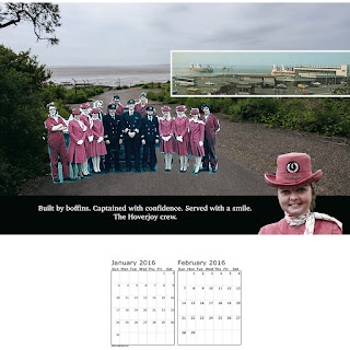
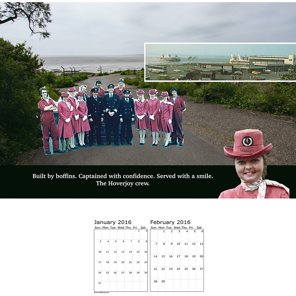
I've overlaid an image of the old Hoverport onto my background so that an idea of the location and the operation will be read by the viewer. In other images I want to include check-in, baggage handling, and interior hovercraft images, to use the calendar to promote the hovercraft company.
I'm pulling my images together quite quickly now - approximately one every two days. This one is more subtle than the previous image. Here the identity stereotyping is implied by the use of gender-loaded verbs and nouns, combined with the crew imagery that shows strong demarcation of gender roles. For example in the strap line, 'captained with confidence' and 'built by boffins' their use implies assertive, innovative jobs to be done by men; 'served with a smile' implies servitude and passivity to be done by women.

12th July.
This ad uses sizeist humour to promote the company's ability to deal with heavy or awkward shaped baggage. Overweight people are still very much used in a negative way in today's advertising. They are frequently used in a so called 'humorist' way to portray problems to be resolved, lazy, etc. Little has changed in this respect.

15th July.
I like the juxtaposition in this image between the Hoverport as it is today, with the old rusting pedestrian bridge, and the montage of the disco.
This ad for the Hoverport's International Lounge is quite blatant, with its 'No Gays' disco ball. I wanted to make this ad to highlight the fact that LGBT people are virtually invisible in advertising. To all intents and purposes we may as well not exist. That is why in my ad, LGBT people are not allowed in the disco and are depicted as 'outside', standing on the bridge, and partially transparent. The irony is that the two women seated in the chair could be read as Lesbian; and indeed Lesbian women are sometimes used in advertising, but often only as objects of Heterosexual male desire - so they are allowed in, under the radar, so to speak.

Here is the same image as an earlier work in progress. As you can see some of the images still have their original backgrounds and have not been masked, re-sized, or placed in position.

16th July.
In this ad I've stated that it is not good enough to conform to the identity stereotype of just being male. To gain access to the on-board Smoker's Lounge, males have to be bearded too. I'm trying to push the idea that stereotyping affects everyone.


17th July.
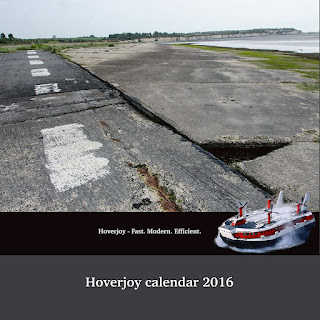
I've finally completed all six images and a cover too. I've left the cover image largely untouched, using just a background, to give an idea of what the Hoverport site is like today. The strap line implies the company is still in operation so there is an ambiguity created between the image and text. I'm not totally sure about the cover yet, to be honest.
I downloaded a free two month per page calendar (not to be confused with the calendar making templates available online) and made pages using In-design to lay it all out. What I forgot to do before I uploaded the images to the printer was leave enough blank space at the top of the page for the wire binding. If I were to put my pages into the binding machine now there would be a line of holes punched right through some of the images! So after all that hassle it looks like I will have to send the images to my tutor unbound. I will correct my error in time for assessment.
Hopefully if they arrive in time I will be able to take them along to the latest Thames Valley group meeting on Saturday. It will be good to get some feedback from fellow students.
July 19th.
Yesterday I took the newly arrived prints from this assignment along to a Thames Valley study group. It is always interesting to see the other students work and catch up on study issues and just chat with other people on the same 'lengthy' degree pathway.
My images and the concept were generally well received by the other students. My text and montages were appreciated and understood with regards to the use of stereotypes in advertising. I was very pleased with this aspect.
There were one or two points to consider. The black and white smoking image was questioned, as its ratio did not match the others. I admitted that this was because the base image from which I created it was more square than the other, landscape format, images. I didn't really know how to correct this and in the allotted time just left it as is. I learnt a very useful technique from Vicki, one of the attending students, on how to use 'content aware scale' in Photoshop to help remedy this problem. I am very grateful to her for showing me how to use this tool as I was unaware of it and it will prove very useful to me.
The 'disco' image was commented on by John, as he thought the 'No Gays' message and partially transparent Gay couple were not noticeable enough. I was quite surprised by this as I thought the text in particular stood out quite well. I realise that in comparison to some of the other more 'in your face' images, this one needs more time to be 'read'. I'll have a think on this aspect.
Jesse Alexander, the OCA tutor in attendance, made some specific comments regarding the aesthetic look of the set as a whole. He didn't think that the images were cohesive enough to form a strong brand identity for the company calendar that I was trying to create. He made a number of points that, if I've understood correctly, I will summarise below:
I think Jesse felt that all these elements combined made the work look tacky. I've slept on the comments and I think I agree that the first two bullet points are justified. The text and logo aspect were not given as much thought as the concept - and the montage work took up a lot of my time. I should have spent more time considering this aspect. If I use colour and the same logo for the whole set, I can see that the work will be more consistent, and stronger, and will actually be more in keeping with a commercial piece of advertising work for a company calendar. The last point regarding simplifying the images I'm not sure about. I can see what he is saying in regards to a more minimal approach. The work will look cleaner and probably be more in keeping with today's advertising style. But I do tend to make imagery that is more complex. I like adding layers of meaning to work, even if it is not fully noticed or understood by all the viewers. I feel that if I pare down the work it will not reflect my personal style or show my own artistic voice.
The images themselves will be made using advertising techniques that I've discovered during my research for this module. I've been struck by how the stereotyping of people is still a potent force in the advertising world. I thought that maybe times have changed, and maybe they have a little, but not much. Lets face it. Advertising is mainly here to support consumer culture, the political hegemony and the status quo - so I shouldn't really be that surprised.
I want to work with these ideas of stereotyping in advertising and make some work that pushes the concept to an extreme. I've visited a local site a lot recently. It's an abandoned hoverport in Kent. Before it closed in 1982 a regular hovercraft service used to run between Ramsgate and Calais, France. I will make my calendar for a fictitious company that used to operate out of the port. The calendar will be used to promote the idea of stylish, modern, international travel in state of the art craft. My ideas around stereotyping will be overlaid onto this concept.
25th June.
I've had a number of ideas on how to visualise the images for my calendar. My first thought was to persuade some family and friends to dress up for me and present stereotypical advertising identities at the site in Ramsgate. The logistics of this seems daunting, considering the amount of unfinished work still to be done on my assignments 1 & 2 before assessment. For this reason I've decided to scale back my ambition and work with digital images appropriated from the internet and overlaid onto the Ramsgate site. In effect, I'm thinking of making some montage work.
5th July.
I began my web searches for 1970s advertising images today. This was the time when the Hoverport was in peak use. My reasoning is that if nothing much has changed in the advertising world regarding the reinforcing of stereotypes I might as well use imagery from that period. I found plenty of useable men and women in different ads. I've also downloaded some old images of hovercraft parked at the Ramsgate site when it was in operation. I have some old crew photos and some internal check-in desk images. A good start!
I now need to select some suitable backgrounds from my own hoverport archive that I've been adding to for the last couple of months.
8th July.
I've made a start on my first image by choosing a background. Then I began to digitally remove my people and objects from my collection of adverts and past them onto my hoverport landscape. I wanted the montages to be quite rough in places, with visible outlines. I'm not sure why I want to use this aesthetic at the moment. I haven't thought about it too much, I'm just going with it and will analyse the images later on.
My hoverport background with a black strip added for my strapline.

Here I've added the hovercraft. In some cases, I've been quite neat with my montage edges. For others I'm going to be much more casual. The people boarding were already in the original montage image.

The idea for this advertising image is to promote weekend breaks for the hoverport company whilst at the same time being incredibly sexist about single women.

Here are my montage images in their original format. As you can see I've had to remove previous strap lines in some cases. I've tidied up areas using the clone and clean-up tool, but I'm not too worried about the roughness. Thinking about it, I want to reference the fakeness in advertising images, where all the people and family groups are usually perfect. My rough montages are an antidote to that.


Here's the final image. As you can see the sexism is directly in the strap line and the gender identity stereotyping is reinforced by the images of couples enjoying their intended weekend break. For other images that I plan to make the identity stereotyping will be implicit, explicit, in the image, in the text, or a combination of all these. I have a number of identity issues that I want to highlight.

10th July.
I've overlaid an image of the old Hoverport onto my background so that an idea of the location and the operation will be read by the viewer. In other images I want to include check-in, baggage handling, and interior hovercraft images, to use the calendar to promote the hovercraft company.
I'm pulling my images together quite quickly now - approximately one every two days. This one is more subtle than the previous image. Here the identity stereotyping is implied by the use of gender-loaded verbs and nouns, combined with the crew imagery that shows strong demarcation of gender roles. For example in the strap line, 'captained with confidence' and 'built by boffins' their use implies assertive, innovative jobs to be done by men; 'served with a smile' implies servitude and passivity to be done by women.
It could be argued that
these terms would be more likely used in 1970s advertising than
today. But when was the last time a woman bus driver, airplane
captain or engineer was represented in advertising? The use of male
visual imagery in these roles is still predominant. The words may
seem subtle and innocuous but advertising reinforces the stereotype
repeatedly, over and over again.; the power of subtle language and
visual imagery becomes magnified and eventually accepted as the norm.

12th July.
This ad uses sizeist humour to promote the company's ability to deal with heavy or awkward shaped baggage. Overweight people are still very much used in a negative way in today's advertising. They are frequently used in a so called 'humorist' way to portray problems to be resolved, lazy, etc. Little has changed in this respect.

15th July.
I like the juxtaposition in this image between the Hoverport as it is today, with the old rusting pedestrian bridge, and the montage of the disco.
This ad for the Hoverport's International Lounge is quite blatant, with its 'No Gays' disco ball. I wanted to make this ad to highlight the fact that LGBT people are virtually invisible in advertising. To all intents and purposes we may as well not exist. That is why in my ad, LGBT people are not allowed in the disco and are depicted as 'outside', standing on the bridge, and partially transparent. The irony is that the two women seated in the chair could be read as Lesbian; and indeed Lesbian women are sometimes used in advertising, but often only as objects of Heterosexual male desire - so they are allowed in, under the radar, so to speak.

Here is the same image as an earlier work in progress. As you can see some of the images still have their original backgrounds and have not been masked, re-sized, or placed in position.

16th July.
In this ad I've stated that it is not good enough to conform to the identity stereotype of just being male. To gain access to the on-board Smoker's Lounge, males have to be bearded too. I'm trying to push the idea that stereotyping affects everyone.

Here I've pushed the idea even further to exclude as many people as possible. To use the 'Perfect Family' tickets being advertised, very rigid criteria is set that often conforms to the 'ideal' family, so often used in advertising images.
As you can see, I'm not that bothered about correct perspective or outlines on some of the figures. I've also used the mask tool to leave halo outlines around some of the males heads!

17th July.
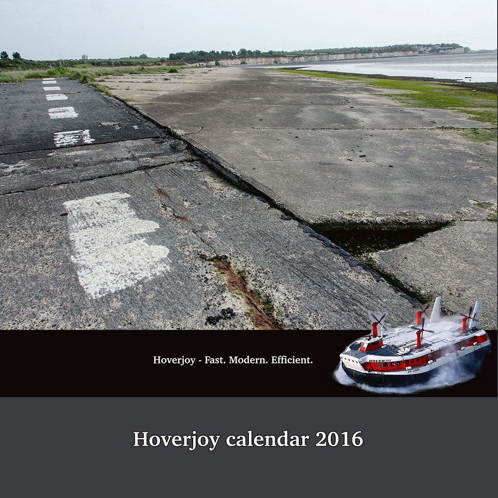
I've finally completed all six images and a cover too. I've left the cover image largely untouched, using just a background, to give an idea of what the Hoverport site is like today. The strap line implies the company is still in operation so there is an ambiguity created between the image and text. I'm not totally sure about the cover yet, to be honest.
I downloaded a free two month per page calendar (not to be confused with the calendar making templates available online) and made pages using In-design to lay it all out. What I forgot to do before I uploaded the images to the printer was leave enough blank space at the top of the page for the wire binding. If I were to put my pages into the binding machine now there would be a line of holes punched right through some of the images! So after all that hassle it looks like I will have to send the images to my tutor unbound. I will correct my error in time for assessment.
Hopefully if they arrive in time I will be able to take them along to the latest Thames Valley group meeting on Saturday. It will be good to get some feedback from fellow students.
July 19th.
Yesterday I took the newly arrived prints from this assignment along to a Thames Valley study group. It is always interesting to see the other students work and catch up on study issues and just chat with other people on the same 'lengthy' degree pathway.
My images and the concept were generally well received by the other students. My text and montages were appreciated and understood with regards to the use of stereotypes in advertising. I was very pleased with this aspect.
There were one or two points to consider. The black and white smoking image was questioned, as its ratio did not match the others. I admitted that this was because the base image from which I created it was more square than the other, landscape format, images. I didn't really know how to correct this and in the allotted time just left it as is. I learnt a very useful technique from Vicki, one of the attending students, on how to use 'content aware scale' in Photoshop to help remedy this problem. I am very grateful to her for showing me how to use this tool as I was unaware of it and it will prove very useful to me.
The 'disco' image was commented on by John, as he thought the 'No Gays' message and partially transparent Gay couple were not noticeable enough. I was quite surprised by this as I thought the text in particular stood out quite well. I realise that in comparison to some of the other more 'in your face' images, this one needs more time to be 'read'. I'll have a think on this aspect.
Jesse Alexander, the OCA tutor in attendance, made some specific comments regarding the aesthetic look of the set as a whole. He didn't think that the images were cohesive enough to form a strong brand identity for the company calendar that I was trying to create. He made a number of points that, if I've understood correctly, I will summarise below:
- the choice of font and logo (Hoverjoy) on the strap lines were not strong enough. I'd used the same font for each image but had themed each logo in relation to the content of the images. For instance, a round beach ball for the baggage handling image, a roundish bag to match the suitcases in the weekend break image. He felt the logo needed to be more consistent.
- The colours between the sets were too different. The beach ball and disco images were quite brightly coloured, where the Hoverjoy crew and perfect family images were muted and retro in their respective colour palettes.
- The montages were too complex and would look better if some of the elements were pared down or removed.
It was also suggested to look at the work of Judith Williamson in respect to my assignment. I will follow this up and put a link here in due course.
July 20th.
Some more comments from the TV group meeting:
I was asked how I would take the work forward. I hadn't considered at this point that the work is anything other than a calendar produced for the fictional company. Obviously I have put my own response to stereotyping into the work so there is an artistic and conceptual angle beyond just the advertising aspect; but I see the calendar as self-contained, and apart from tweaking the imagery in response to tutor feedback, it is over for me and I am ready to move on to the next assignment.
Keith mentioned that the calendar could be used as part of an equalities campaign and therefore contacting one of the appropriate agencies might be a good idea. John suggested that I could take the loose calendar pages back to the Hoverport site and photograph them in-situ. This is an interesting idea and would open up the possibilities for the work. Another thought that has occurred to me is to somehow produce the work on billboards and re-construct them at the site. It is clear that there are a number of ways that the work could be taken forward.
For now I am content to document the work's possibilities and move on. I do not have any desire to continue working with montage although who knows, I may return to the work for inspiration at level three. The other consideration is that my 'Rubber Flapper' assignment used up a lot of work hours during this course. I still have one more archive image to make, let alone think about pulling the hand-made book together before assessment. I have the changes to this assignment and assignment 1 to make as well. I don't think I can give all the assignments equal attention at this point without going over the two year time limit for the course. I need to keep March 2016 assessment in mind and pace myself appropriately.
Jan 12th:
I've returned to working on this assignment in the last week. I spent the time removing extraneous detail from some of the images. With a large span of time between making and presenting the work at the Thames Valley group I can see that Jesse was right about some of the images being too busy. Less is definitely more. I've removed detail from the following images:


The images are stronger for having less detail. I've also standardised the logo on the banner by using the same woman employee rather than a collection of hovercrafts, beach & disco balls, etc. This ties the images together and looks more corporate.
I also spent a great deal of time trying to pull together the images with colour. Trying to match the reds and blues etc. Because the material comes from multiple sources this was very hard to do. In the end I discarded this idea. I was making the work look 'muddy' and muted in my attempts at colour correction. I think the work done so far is enough to give the set a coherent look.
July 20th.
Some more comments from the TV group meeting:
I was asked how I would take the work forward. I hadn't considered at this point that the work is anything other than a calendar produced for the fictional company. Obviously I have put my own response to stereotyping into the work so there is an artistic and conceptual angle beyond just the advertising aspect; but I see the calendar as self-contained, and apart from tweaking the imagery in response to tutor feedback, it is over for me and I am ready to move on to the next assignment.
Keith mentioned that the calendar could be used as part of an equalities campaign and therefore contacting one of the appropriate agencies might be a good idea. John suggested that I could take the loose calendar pages back to the Hoverport site and photograph them in-situ. This is an interesting idea and would open up the possibilities for the work. Another thought that has occurred to me is to somehow produce the work on billboards and re-construct them at the site. It is clear that there are a number of ways that the work could be taken forward.
For now I am content to document the work's possibilities and move on. I do not have any desire to continue working with montage although who knows, I may return to the work for inspiration at level three. The other consideration is that my 'Rubber Flapper' assignment used up a lot of work hours during this course. I still have one more archive image to make, let alone think about pulling the hand-made book together before assessment. I have the changes to this assignment and assignment 1 to make as well. I don't think I can give all the assignments equal attention at this point without going over the two year time limit for the course. I need to keep March 2016 assessment in mind and pace myself appropriately.
Jan 12th:
I've returned to working on this assignment in the last week. I spent the time removing extraneous detail from some of the images. With a large span of time between making and presenting the work at the Thames Valley group I can see that Jesse was right about some of the images being too busy. Less is definitely more. I've removed detail from the following images:


The images are stronger for having less detail. I've also standardised the logo on the banner by using the same woman employee rather than a collection of hovercrafts, beach & disco balls, etc. This ties the images together and looks more corporate.
I also spent a great deal of time trying to pull together the images with colour. Trying to match the reds and blues etc. Because the material comes from multiple sources this was very hard to do. In the end I discarded this idea. I was making the work look 'muddy' and muted in my attempts at colour correction. I think the work done so far is enough to give the set a coherent look.
Monday, 29 June 2015
Exercise: implicit and explicit
I've sourced a number of advertisements below that I believe use either implicit or explicit advertising methods to sell their products.
The ad below for deodorant, is selling the idea of a woman's sexual availability to any man that uses the product. The ad uses a visual metaphor for sex but the connotations are very easy to read. I would say there is an explicit visual message being used to promote the brand.

In this ad the company is promoting a salad dish. The visual joke is that the consumer, a woman who is concerned about her weight, has become so thin from eating the salad product that the company's ubiquitous paper crown just slips down her head to her ankles. This is an implicit message, promoting the value of the product in achieving weight loss. Although maybe not intended, I can detect a second message here too. We all know sex sells. The crown around the woman's ankles could also be a visual metaphor for getting lucky - because eating the product will make you more likely to be thin and sexually attractive?

This ad for sexual health is about explicit in advertising terms as they get. There is no subtle message here, the message is clear. Carry a condom because you never know where you will need to use it.

This climate change ad uses an implicit advertising message. The implication being that not acting on climate change and rising sea levels will result in human adaptation to fish-headed men. The viewer has to understand the visual metaphor to be able to understand the message. No-one seriously believes that we will evolve into half fish, half human. The message is projecting a possible scenario in our distant future to remind us to act now before it is too late.

In many ads the consumer is aware that the message being sold is unlikely. The deodorant ad above for example. I'm sure many young men realise that using the product is not going to allow them free access to sex with women covering themselves in cream. What happens is they enjoy the message. They want to see themselves like the man in the ad who is going to get lucky. They align themselves with the ad's message and product. A fantasy is being sold and the viewer consumer knows it but buys into the product all the same. Advertising can be very complex and subtle at times and often plays subliminal tricks on the mind.
Sunday, 28 June 2015
Exercise: what are they selling?

In this skincare ad for moisturiser, the idea of preserving youthful skin is being sold to a mainly female audience. The split image uses the notion of scientific rigour to portray before and after images that 'prove' the ads claims. Text is used to point out four areas of visible skin improvement.
From the list of eight hidden needs of psycho seduction, I've found three that are implicit in this advertisement:
immortality
reassurance of worth
emotional security

In this ad for Ducati motorbikes thrills, speed and freedom, are being sold mainly to men. The idea of breaking the law is denoted in the image as the police helicopter is the only machine fast enough to catch the speeding biker. The ad has connotations of rebelliousness.
From the list of eight hidden needs of psycho seduction, I've found three that are implicit in this advertisement:
reassurance of worth
ego gratification
sense of power

This beer ad uses tradition and a shooting party to portray its brand as belonging to an elite club. The image connotes class status and wealth. The couple having a picnic in the foreground appear to be separate from the main party but still part of the traditional activities taking place.
From the list of eight hidden needs of psycho seduction, I've found three that are implicit in this advertisement:
sense of roots
reassurance of worth
ego gratification
Subscribe to:
Posts (Atom)