For this assignment I need to make 7 advertising images for an A3 calendar for a company of my choosing. Six of them are for the body of the calendar, two months to a page, and the final one for the cover. I think this format has been chosen to make it easier for the student - with a smaller number of images required. In reality it has made producing an actual calendar harder. Online publishers do not provide a two months per page format. I'm guessing they would rather print a 12 page, month per page calendar, than a six page one. I've looked at a number of online sites and they offer all sorts of templates for changing options - but not to print a two month per page calendar. So I'm kind of stuck at this point. I'm not sure what other OCA students have done with this assignment. One option is that I have an A4 binding machine at home that I've used for binding assessment material. I could make my own calendar using that. I'm pretty sure I could fit 12x12 pages into the binder, but definitely not A3 size. I think I'm just going to have to go with that.
The images themselves will be made using advertising techniques that I've discovered during my research for this module. I've been struck by how the stereotyping of people is still a potent force in the advertising world. I thought that maybe times have changed, and maybe they have a little, but not much. Lets face it. Advertising is mainly here to support consumer culture, the political hegemony and the status quo - so I shouldn't really be that surprised.
I want to work with these ideas of stereotyping in advertising and make some work that pushes the concept to an extreme. I've visited a local site a lot recently. It's an abandoned hoverport in Kent. Before it closed in 1982 a regular hovercraft service used to run between Ramsgate and Calais, France. I will make my calendar for a fictitious company that used to operate out of the port. The calendar will be used to promote the idea of stylish, modern, international travel in state of the art craft. My ideas around stereotyping will be overlaid onto this concept.
25th June.
I've had a number of ideas on how to visualise the images for my calendar. My first thought was to persuade some family and friends to dress up for me and present stereotypical advertising identities at the site in Ramsgate. The logistics of this seems daunting, considering the amount of unfinished work still to be done on my assignments 1 & 2 before assessment. For this reason I've decided to scale back my ambition and work with digital images appropriated from the internet and overlaid onto the Ramsgate site. In effect, I'm thinking of making some montage work.
5th July.
I began my web searches for 1970s advertising images today. This was the time when the Hoverport was in peak use. My reasoning is that if nothing much has changed in the advertising world regarding the reinforcing of stereotypes I might as well use imagery from that period. I found plenty of useable men and women in different ads. I've also downloaded some old images of hovercraft parked at the Ramsgate site when it was in operation. I have some old crew photos and some internal check-in desk images. A good start!
I now need to select some suitable backgrounds from my own hoverport archive that I've been adding to for the last couple of months.
8th July.
I've made a start on my first image by choosing a background. Then I began to digitally remove my people and objects from my collection of adverts and past them onto my hoverport landscape. I wanted the montages to be quite rough in places, with visible outlines. I'm not sure why I want to use this aesthetic at the moment. I haven't thought about it too much, I'm just going with it and will analyse the images later on.
My hoverport background with a black strip added for my strapline.
Here I've added the hovercraft. In some cases, I've been quite neat with my montage edges. For others I'm going to be much more casual. The people boarding were already in the original montage image.
The idea for this advertising image is to promote weekend breaks for the hoverport company whilst at the same time being incredibly sexist about single women.
Here are my montage images in their original format. As you can see I've had to remove previous strap lines in some cases. I've tidied up areas using the clone and clean-up tool, but I'm not too worried about the roughness. Thinking about it, I want to reference the fakeness in advertising images, where all the people and family groups are usually perfect. My rough montages are an antidote to that.
Here's the final image. As you can see the sexism is directly in the strap line and the gender identity stereotyping is reinforced by the images of couples enjoying their intended weekend break. For other images that I plan to make the identity stereotyping will be implicit, explicit, in the image, in the text, or a combination of all these. I have a number of identity issues that I want to highlight.
10th July.
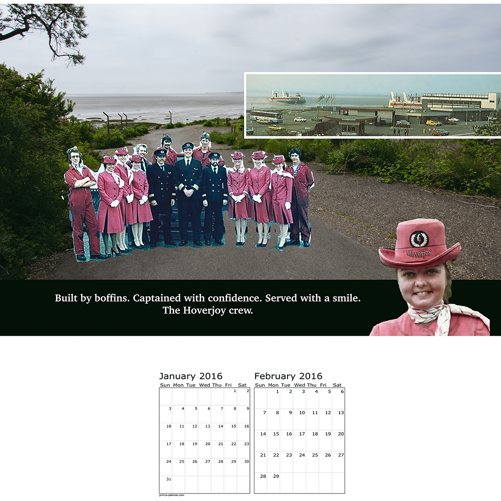
I've overlaid an image of the old Hoverport onto my background so that an idea of the location and the operation will be read by the viewer. In other images I want to include check-in, baggage handling, and interior hovercraft images, to use the calendar to promote the hovercraft company.
I'm pulling my images together quite quickly now - approximately one every two days. This one is more subtle than the previous image. Here the identity stereotyping is implied by the use of gender-loaded verbs and nouns, combined with the crew imagery that shows strong demarcation of gender roles. For example in the strap line, 'captained with confidence' and 'built by boffins' their use implies assertive, innovative jobs to be done by men; 'served with a smile' implies servitude and passivity to be done by women.
It could be argued that
these terms would be more likely used in 1970s advertising than
today. But when was the last time a woman bus driver, airplane
captain or engineer was represented in advertising? The use of male
visual imagery in these roles is still predominant. The words may
seem subtle and innocuous but advertising reinforces the stereotype
repeatedly, over and over again.; the power of subtle language and
visual imagery becomes magnified and eventually accepted as the norm.
12th July.
This ad uses sizeist humour to promote the company's ability to deal with heavy or awkward shaped baggage. Overweight people are still very much used in a negative way in today's advertising. They are frequently used in a so called 'humorist' way to portray problems to be resolved, lazy, etc. Little has changed in this respect.
15th July.
I like the juxtaposition in this image between the Hoverport as it is today, with the old rusting pedestrian bridge, and the montage of the disco.
This ad for the Hoverport's International Lounge is quite blatant, with its 'No Gays' disco ball. I wanted to make this ad to highlight the fact that LGBT people are virtually invisible in advertising. To all intents and purposes we may as well not exist. That is why in my ad, LGBT people are not allowed in the disco and are depicted as 'outside', standing on the bridge, and partially transparent. The irony is that the two women seated in the chair could be read as Lesbian; and indeed Lesbian women are sometimes used in advertising, but often only as objects of Heterosexual male desire - so they are allowed in, under the radar, so to speak.
Here is the same image as an earlier work in progress. As you can see some of the images still have their original backgrounds and have not been masked, re-sized, or placed in position.
16th July.
In this ad I've stated that it is not good enough to conform to the identity stereotype of just being male. To gain access to the on-board Smoker's Lounge, males have to be bearded too. I'm trying to push the idea that stereotyping affects everyone.
Here I've pushed the idea even further to exclude as many people as possible. To use the 'Perfect Family' tickets being advertised, very rigid criteria is set that often conforms to the 'ideal' family, so often used in advertising images.
As you can see, I'm not that bothered about correct perspective or outlines on some of the figures. I've also used the mask tool to leave halo outlines around some of the males heads!
17th July.
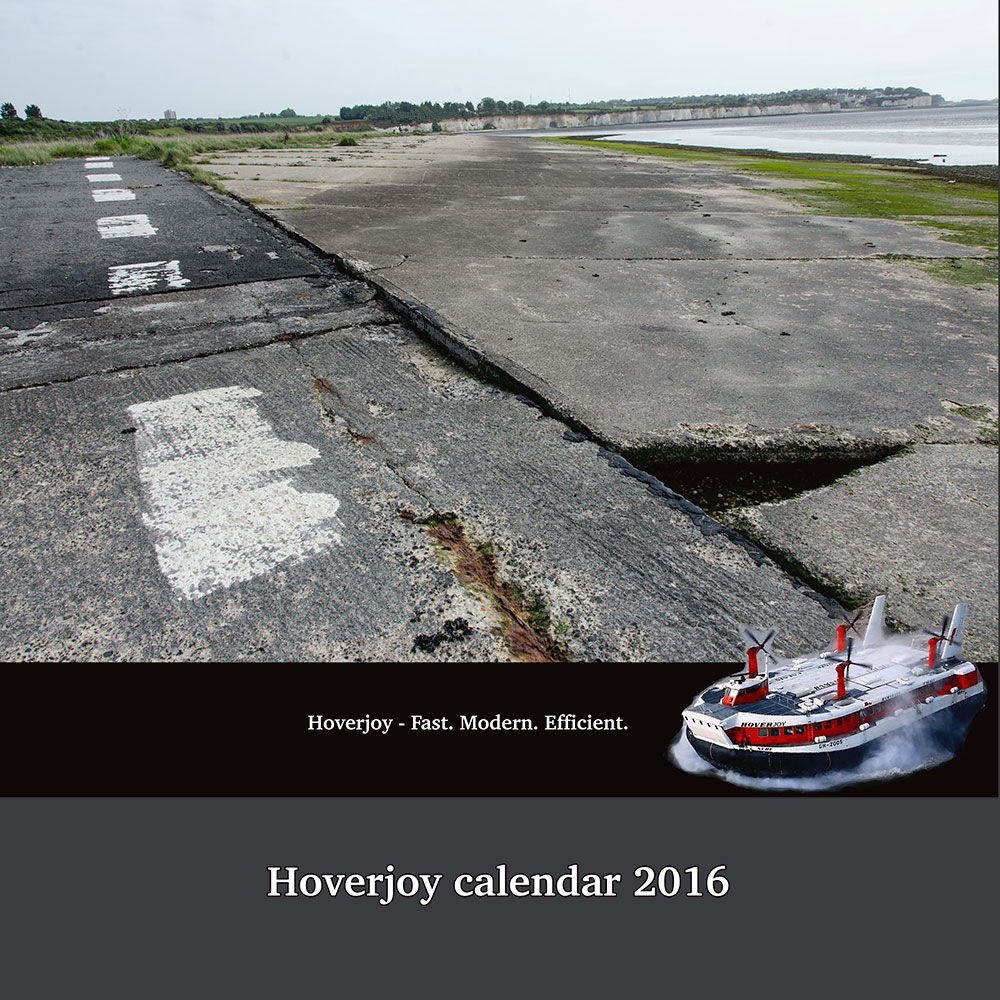
I've finally completed all six images and a cover too. I've left the cover image largely untouched, using just a background, to give an idea of what the Hoverport site is like today. The strap line implies the company is still in operation so there is an ambiguity created between the image and text. I'm not totally sure about the cover yet, to be honest.
I downloaded a free two month per page calendar (not to be confused with the calendar making templates available online) and made pages using In-design to lay it all out. What I forgot to do before I uploaded the images to the printer was leave enough blank space at the top of the page for the wire binding. If I were to put my pages into the binding machine now there would be a line of holes punched right through some of the images! So after all that hassle it looks like I will have to send the images to my tutor unbound. I will correct my error in time for assessment.
Hopefully if they arrive in time I will be able to take them along to the latest Thames Valley group meeting on Saturday. It will be good to get some feedback from fellow students.
July 19th.
Yesterday I took the newly arrived prints from this assignment along to a Thames Valley study group. It is always interesting to see the other students work and catch up on study issues and just chat with other people on the same 'lengthy' degree pathway.
My images and the concept were generally well received by the other students. My text and montages were appreciated and understood with regards to the use of stereotypes in advertising. I was very pleased with this aspect.
There were one or two points to consider. The black and white smoking image was questioned, as its ratio did not match the others. I admitted that this was because the base image from which I created it was more square than the other, landscape format, images. I didn't really know how to correct this and in the allotted time just left it as is. I learnt a very useful technique from Vicki, one of the attending students, on how to use 'content aware scale' in Photoshop to help remedy this problem. I am very grateful to her for showing me how to use this tool as I was unaware of it and it will prove very useful to me.
The 'disco' image was commented on by John, as he thought the 'No Gays' message and partially transparent Gay couple were not noticeable enough. I was quite surprised by this as I thought the text in particular stood out quite well. I realise that in comparison to some of the other more 'in your face' images, this one needs more time to be 'read'. I'll have a think on this aspect.
Jesse Alexander, the OCA tutor in attendance, made some specific comments regarding the aesthetic look of the set as a whole. He didn't think that the images were cohesive enough to form a strong brand identity for the company calendar that I was trying to create. He made a number of points that, if I've understood correctly, I will summarise below:
- the choice of font and logo (Hoverjoy) on the strap lines were not strong enough. I'd used the same font for each image but had themed each logo in relation to the content of the images. For instance, a round beach ball for the baggage handling image, a roundish bag to match the suitcases in the weekend break image. He felt the logo needed to be more consistent.
- The colours between the sets were too different. The beach ball and disco images were quite brightly coloured, where the Hoverjoy crew and perfect family images were muted and retro in their respective colour palettes.
- The montages were too complex and would look better if some of the elements were pared down or removed.
I think Jesse felt that all these elements combined made the work look tacky. I've slept on the comments and I think I agree that the first two bullet points are justified. The text and logo aspect were not given as much thought as the concept - and the montage work took up a lot of my time. I should have spent more time considering this aspect. If I use colour and the same logo for the whole set, I can see that the work will be more consistent, and stronger, and will actually be more in keeping with a commercial piece of advertising work for a company calendar. The last point regarding simplifying the images I'm not sure about. I can see what he is saying in regards to a more minimal approach. The work will look cleaner and probably be more in keeping with today's advertising style. But I do tend to make imagery that is more complex. I like adding layers of meaning to work, even if it is not fully noticed or understood by all the viewers. I feel that if I pare down the work it will not reflect my personal style or show my own artistic voice.
It was also suggested to look at the work of Judith Williamson in respect to my assignment. I will follow this up and put a link here in due course.
July 20th.
Some more comments from the TV group meeting:
I was asked how I would take the work forward. I hadn't considered at this point that the work is anything other than a calendar produced for the fictional company. Obviously I have put my own response to stereotyping into the work so there is an artistic and conceptual angle beyond just the advertising aspect; but I see the calendar as self-contained, and apart from tweaking the imagery in response to tutor feedback, it is over for me and I am ready to move on to the next assignment.
Keith mentioned that the calendar could be used as part of an equalities campaign and therefore contacting one of the appropriate agencies might be a good idea. John suggested that I could take the loose calendar pages back to the Hoverport site and photograph them in-situ. This is an interesting idea and would open up the possibilities for the work. Another thought that has occurred to me is to somehow produce the work on billboards and re-construct them at the site. It is clear that there are a number of ways that the work could be taken forward.
For now I am content to document the work's possibilities and move on. I do not have any desire to continue working with montage although who knows, I may return to the work for inspiration at level three. The other consideration is that my 'Rubber Flapper' assignment used up a lot of work hours during this course. I still have one more archive image to make, let alone think about pulling the hand-made book together before assessment. I have the changes to this assignment and assignment 1 to make as well. I don't think I can give all the assignments equal attention at this point without going over the two year time limit for the course. I need to keep March 2016 assessment in mind and pace myself appropriately.
Jan 12th:
I've returned to working on this assignment in the last week. I spent the time removing extraneous detail from some of the images. With a large span of time between making and presenting the work at the Thames Valley group I can see that Jesse was right about some of the images being too busy. Less is definitely more. I've removed detail from the following images:
The images are stronger for having less detail. I've also standardised the logo on the banner by using the same woman employee rather than a collection of hovercrafts, beach & disco balls, etc. This ties the images together and looks more corporate.
I also spent a great deal of time trying to pull together the images with colour. Trying to match the reds and blues etc. Because the material comes from multiple sources this was very hard to do. In the end I discarded this idea. I was making the work look 'muddy' and muted in my attempts at colour correction. I think the work done so far is enough to give the set a coherent look.